![]()
The topic of lowercase logos came up recently when I shared a before-and-after image on Instagram. A question was raised: What is my creative reasoning for all lowercase letters in a logo? Great question. Company names are proper nouns. Shouldn’t they always be capitalized in a wordmark?
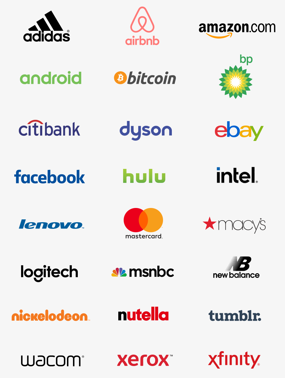
Familiar examples of lowercase logos
We’re probably used to seeing more lowercase logos than we think. Some popular ones:
Here’s how I approach the capitalization question.
A logo is a small tag that represents a company. It functions more like a picture than a word. It needs to be readable, for sure. But it also needs to look visually appealing and hint at the brand’s personality. With that in mind, I consider:
1. How does the lettering look best?
For a minute, forget about grammar rules. Don’t look at the logo as letters or words. See it as a collection of meaningless shapes that need to fit together in a visually harmonious way. An uppercase “L” contains a lot of empty space, while a lowercase “l” avoids the empty hole. However, the lowercase “l” can look like a capital “I” in some fonts, which can be confusing in unusual words.
Other tricky letters are T, P, F and characters with slanted sides like A, Y, V, and W. They’re difficult to kern (designer lingo for adjusting the horizontal spacing between characters). The letters that follow can help or hurt. “Aw” is great! The “w” can snuggle right up. “Ah” is less great. The “h” traps some space.
And what about the entire wordmark—is it one short word where a hole will stand out? Or is it a long word that can handle more variety in the negative spaces, because there are lots of them that create a rhythm? Will multiple words need to be stacked, so that any ascenders and descenders (the parts that poke up, like in “k,” or hang down, like in “y”) will interfere? All things to consider.
I usually start with title case in logos. It’s traditional and will most closely match the company name in regular copywriting. But if there are difficult letters, I’ll try all lowercase and all uppercase.
Then…
2. If all lowercase (or uppercase) visually looks better, is there a conceptual rationale?
An all-lowercase logo looks approachable and friendly. It feels casual and accessible. If a logo belongs to a brand for kids, or one that wants to be popular among direct consumers, lowercase could make sense, while law firms, universities, and many B2B companies would avoid it.
Conversely, all-uppercase lettering is powerful and authoritative. It feels dominant and strong.
Lantern Academy is an after-school tutoring center for kids. Besides closing the gap after the “L,” lowercase made sense conceptually.
![]()
In recent years, we’ve seen a trend where large corporations swap their caps for lowercase logos when they want to be seen as more friendly and human. (Keeping the capital letters in written copy.) I’m sure the pendulum will swing back in a few years. Trends always do!
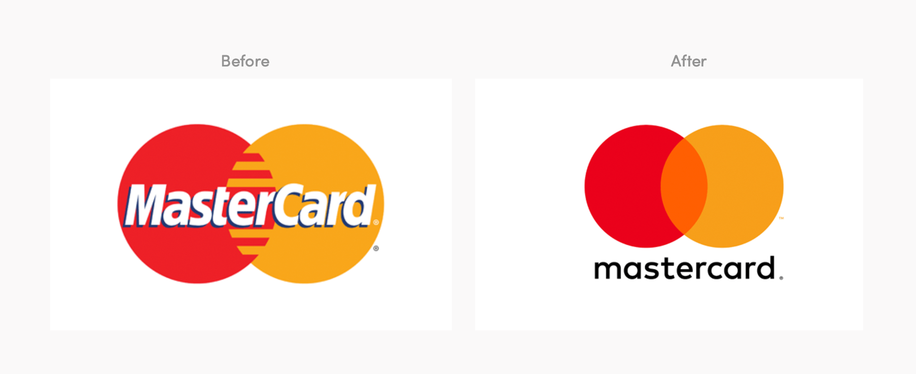
Mastercard logo redesign by Pentagram. Does this make conceptual sense? Not to me—I’d expect a payment processing corporation to look more… corporate.
![]()
Fisher-Price logo redesign by Pentagram. Full project here. Does this make sense? Yes! It’s a toy company.
In summary
When considering case, I think about how the logo looks best, and which case will make sense logically for the brand.
If you adore looking at logo roundups, also check out:
- Logos for super long company names (or, how to make your designer cry)
- Logos that are someone’s last name (examples for clients)
- Logos with “the” in the name (“the” can be annoying to deal with)
- Logos that replace a letter with a picture (fraught with peril)
- Types of logos 101 (the main categories)