When designing a logo, some company names are easier to work with than others. One-word names are my favorite— it’s possible to make a simple, very distinctive wordmark. Long names are harder. They can look great, but it’s also easy to make them busy and over-designed. Company names that include the word “the” can be tricky, too. Let’s see how other designers have dealt with this challenge. Below is a roundup of logos with “the” in the name.
Why is it hard to work with the word “the” in a logo?
That pesky article is so short it can throw off the whole balance of a wordmark. Figuring out where to tuck it in can be difficult. Should it be smaller than the more important words? Should it stay the same size? Things you never knew designers worried about!
Most commonly we see “the” in book and movie titles, “the museum of,” “the university of,” and “the [fill-in-the-blank] theater,” but this little word can pop up in any industry. Seeing how other brands handle “the” in their logos can be helpful.
Make “the” subordinate to other words
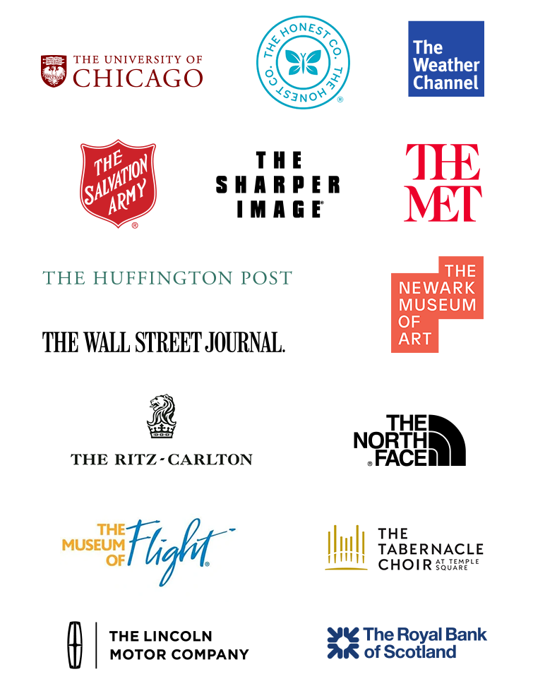
These examples make the word “the” less important by making it smaller, thinner, lowercase, or a lighter color.
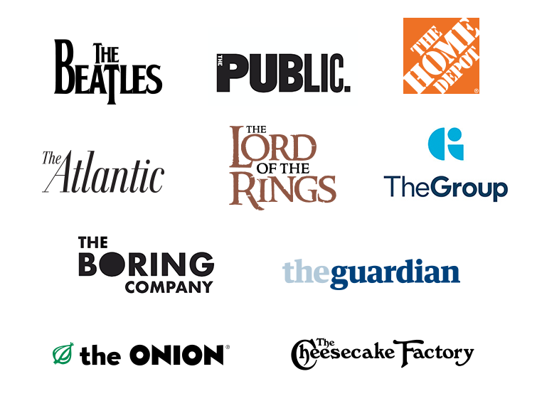
Make “the” equal to other words
These logos set the article “the” in the same style as the words that follow it. I often prefer this approach, since it can look more polished. It’s more cohesive with fewer fussy bits.
If you adore looking at logo roundups, also check out:
- Logos for super long company names (also known as: how to make your designer cry)
- Logos that are someone’s last name (examples for clients)
- All-lowercase logos (should you or shouldn’t you?)
- Logos that replace a letter with a picture (fraught with peril)
- Types of logos 101 (the main categories)