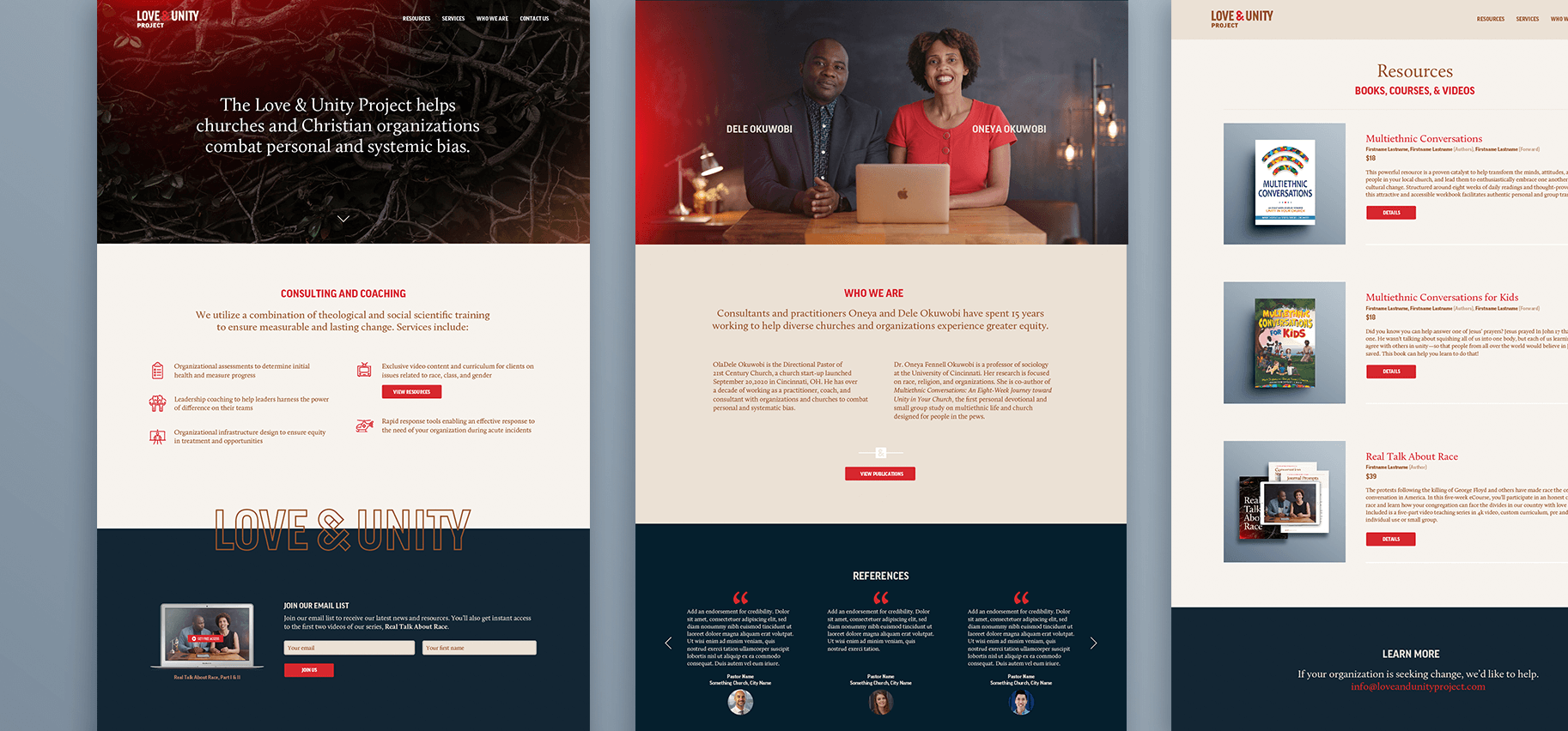
Led by a pastor and a sociologist, the Love and Unity Project works to combat bias in race, gender, and class. The organization offers consulting and coaching for Christian churches looking for measurable and lasting change.
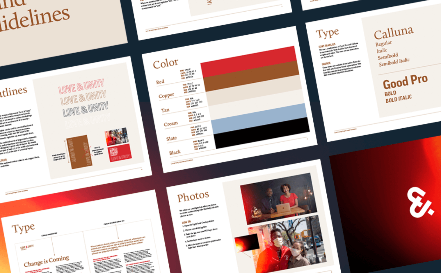
For a logo for this non-profit, we wanted to avoid diversity clichés like multicolored people holding hands. I proposed constructing a symbol with built-in meaning. Using the ampersand from the name made sense, since the idea of “and” inherently welcomes everybody. We built it from a U for unity and a heart for love, and wove them together.
We also needed a look and feel for course materials and content. Teachings are based in theological training and social science data, so the design needed to lean a little bit academic. But it also needed to feel accessible to an audience of everyday people.
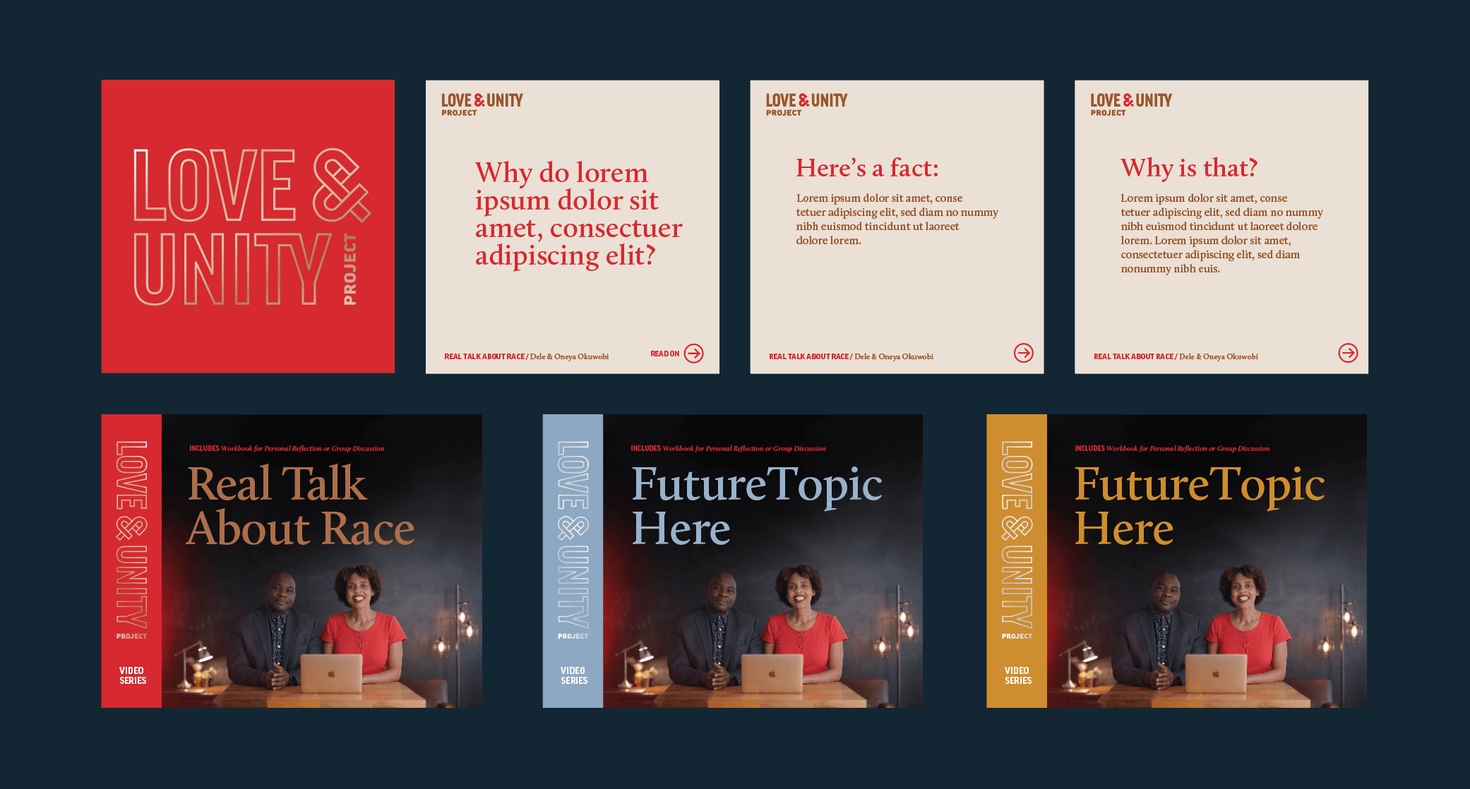
We used bright red to catch the eye. It’s the color of hearts and love. It’s also the color of blood and fire. We don’t want to scare people off with something that looks scary or dire, but this work is important and a note of urgency is not inappropriate. A glowing red lens flare added to photos carries on this theme. It’s an easy, practical way to add a recognizable “signature look” to the organization’s stuff.
A featured tree branches image can represent both a tangled problem to solve, and beautiful interconnectedness, with green leaves as signs of growth.

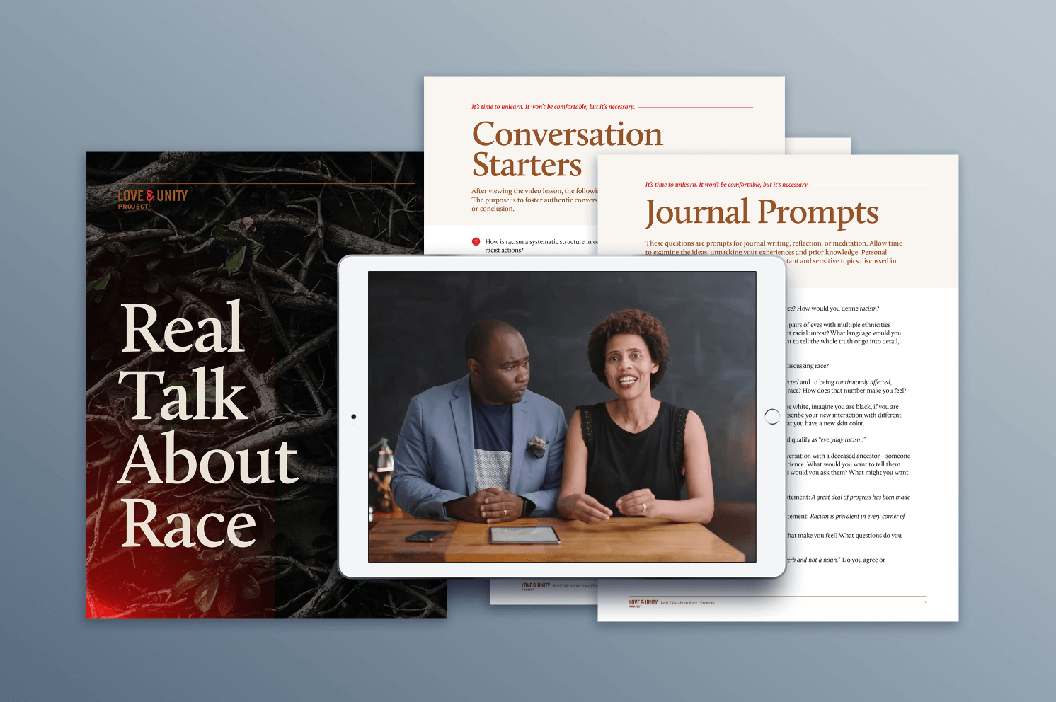
I designed a set of worksheets for the first course launch and a two-page website they handed off to their developer to build.
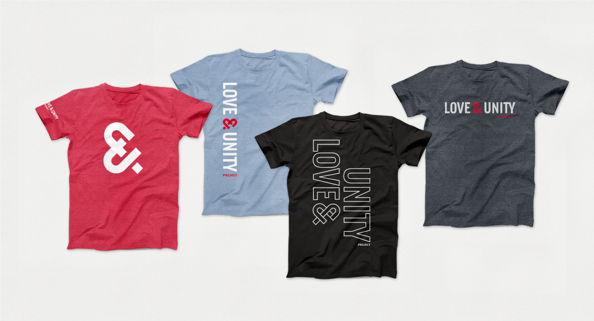
We also imagined what shirts could look like for clients who go through trainings and get pumped about supporting this work. Which includes me!