
Greetings, office peeps! When you’re designing a Powerpoint presentation or Word document, do you ever feel like something doesn’t look right? You can’t put your finger on it. Somehow the page looks amateur instead of professional. If you don’t have a designer friend to advise you, or enough time to hire a pro, these DIY design tips can help. Small tweaks will make your page layouts and Powerpoint presentations look more professional.
1. Gather all the content before you start
Have your text written and any crucial pictures and graphs in a folder, collected before you start designing. Then, like with a moving truck full of furniture, you can simply unpack it and place it around the room. You don’t want somebody showing up with a surprise piano halfway through! You can always add non-essential decorative elements later, but make sure you’ve got all the key ingredients before you start arranging content.
2. Begin with the longest slide
If you’re making a multi-page document, design the page or slide that has the most text first. Use this page as a starting template for the rest of your pages. Then you’ll never run out of room on a page later. You’ll already have planned for the most stuff that needs to fit. If some pages end up with extra white space, great! You can make a picture bigger or just leave some breathing room. (More on that in a sec.)
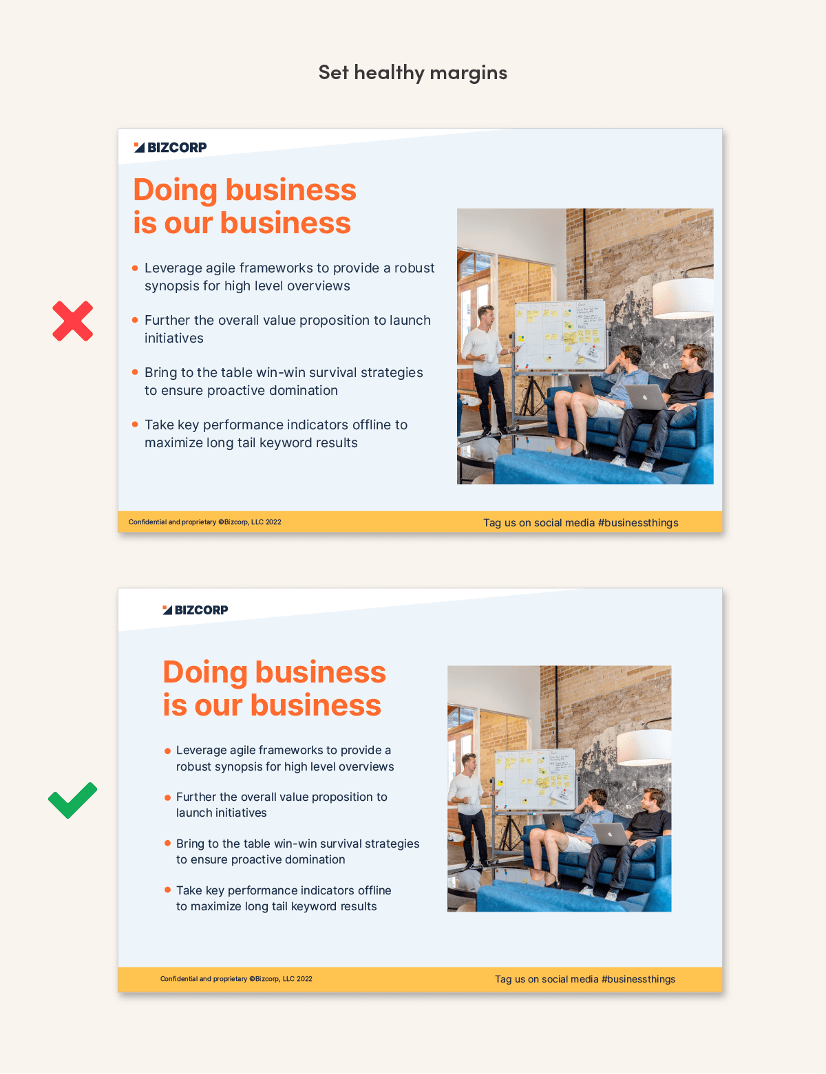
3. Set healthy margins
A common mistake is skinny margins. Placing items too close to the edges of your document creates uneasy tension. Like a glass on the edge of table near a toddler or a cat.
Pull your content away from the edges, and your page will look more professional. If needed, scale down fonts and pictures, or move some elements to the next slide.
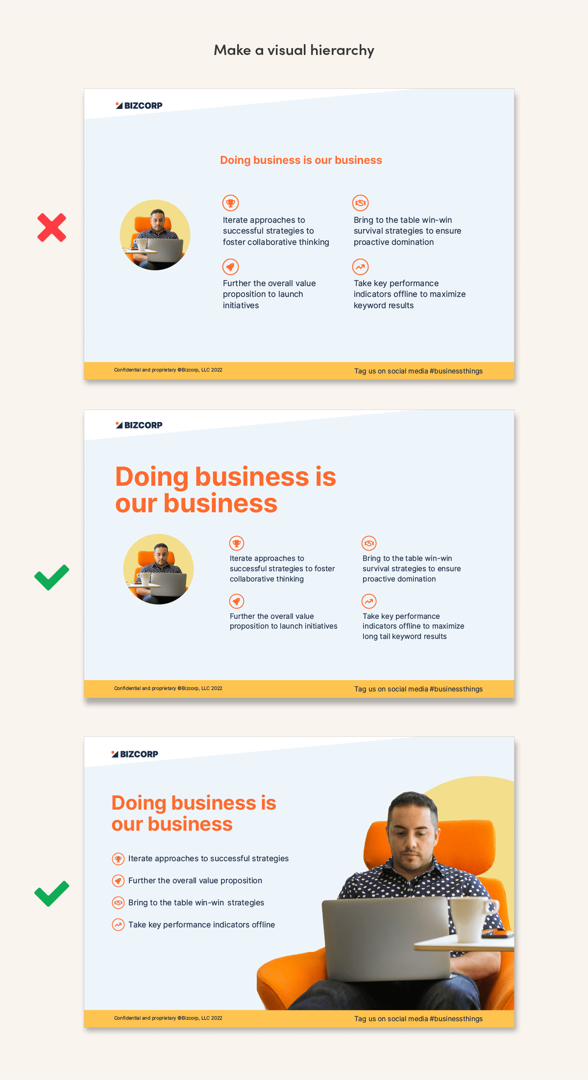
4. Make a visual hierarchy
Where do you want people to look first? Interesting layouts have a clear focal point, where one item is bigger or louder than everything else. A main image could be the star, or big text could be the star. If everything in your layout commands the same attention, the page is boring and our eyes don’t know where to land. Layouts that have a nice mix look more dynamic: a main big thing, some medium things, and some small things.
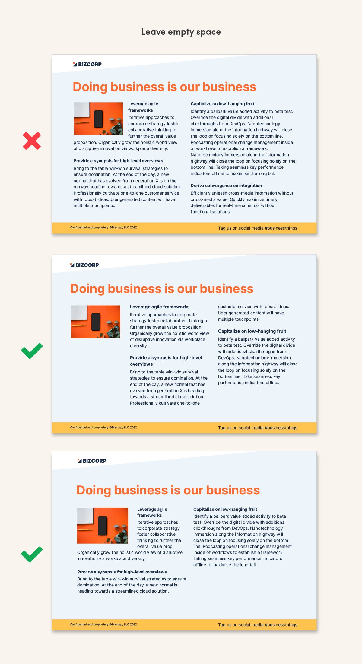
5. Leave empty space
Unless it’s a dense report or a novel, filling every bit of white space feels crowded and daunting to readers. Aim to leave a quarter of your page empty. You might need to ruthlessly cut some content, shrink pictures, or use more pages. If it’s a presentation, see if you can boil your points down to a short phrase each. The examples below show pages that need to be readable on their own, like a brochure. If you’re presenting live, use just a few lines or points per slide.
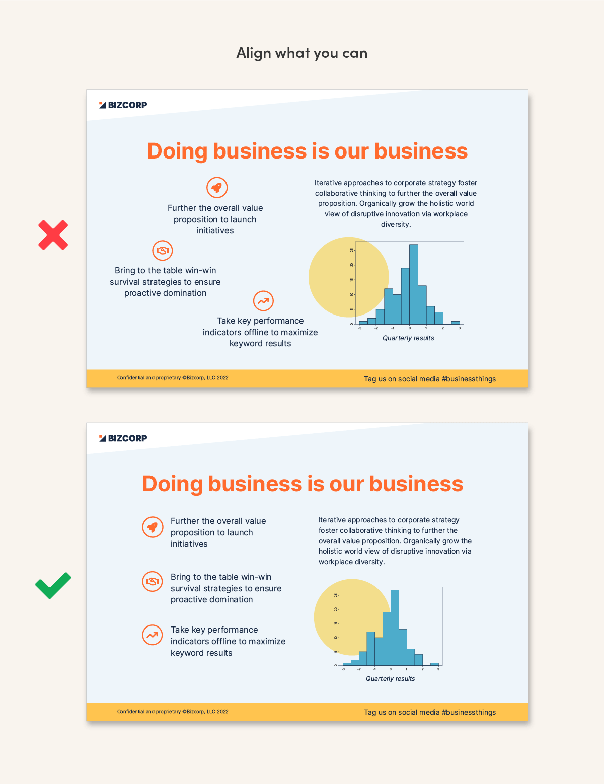
 6. Align what you can
Our eyes move through layouts by following edges—edges of paragraphs, boxes, lines, etc. Make it easy for readers to move through your layout by keeping essential elements organized in rows and columns.
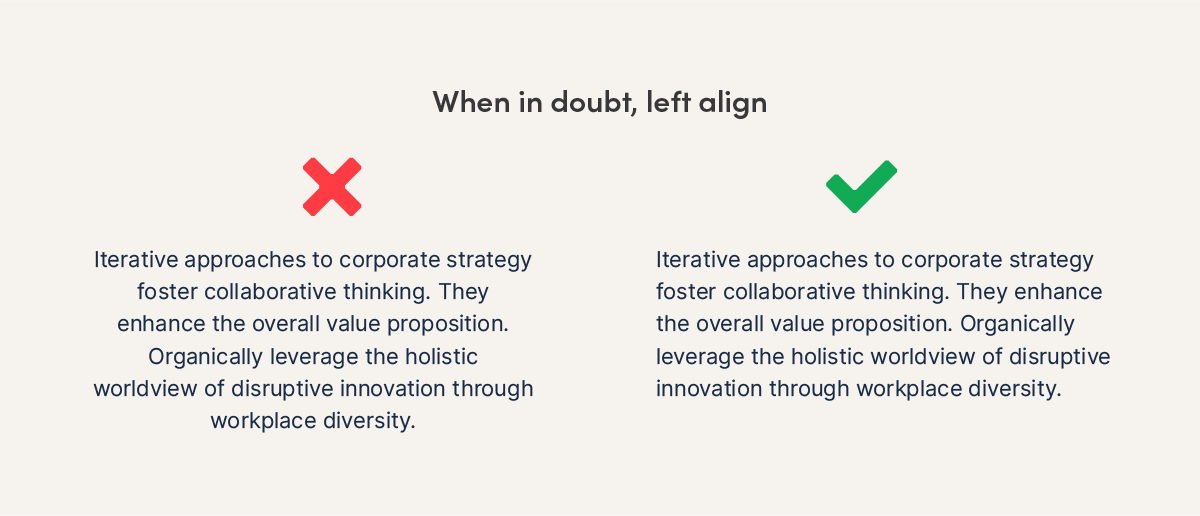
7. When in doubt, left align text
Centering lengthy copy looks messy. Those ragged edges mean each line begins in a different place. Our eyes have to do more work to find the start of each row. This is fine when you have only three or four short lines of text, but not when you have more than that. In that case, left alignment is better.
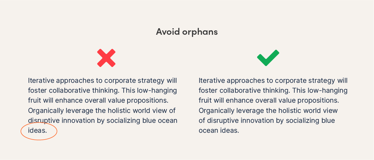
8. Avoid orphans
In typography, an orphan is a sad little word that ends up on a line all by itself at the bottom of a paragraph. They are not cute! Look after those little babies and give them a family. Type some soft returns (shift+enter) to break lines at better places, pushing another word or two down to keep your orphan company.
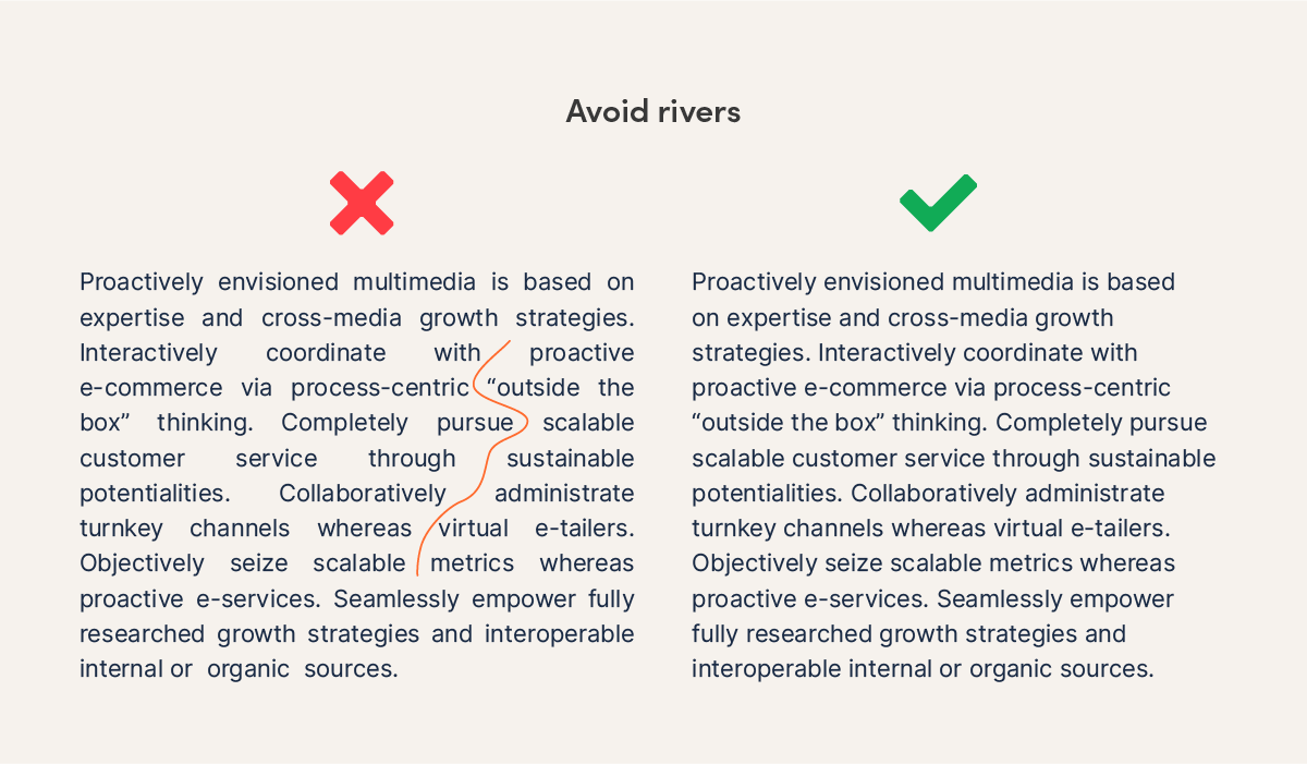
9. Avoid rivers
Rivers are awkward trails of vertical space that can show up in justified paragraphs. “Justification” is an option for text alignment, where space is added between words to make the left and right edges of a paragraph line up. Choosing justified alignment is not always wrong, but it’s harder to work with. To fix rivers, you’ll need a generous number of words per line and lots of hyphens, often added manually. This is a hassle. In general, left alignment is a better choice than justification. It prevents unsightly rivers.
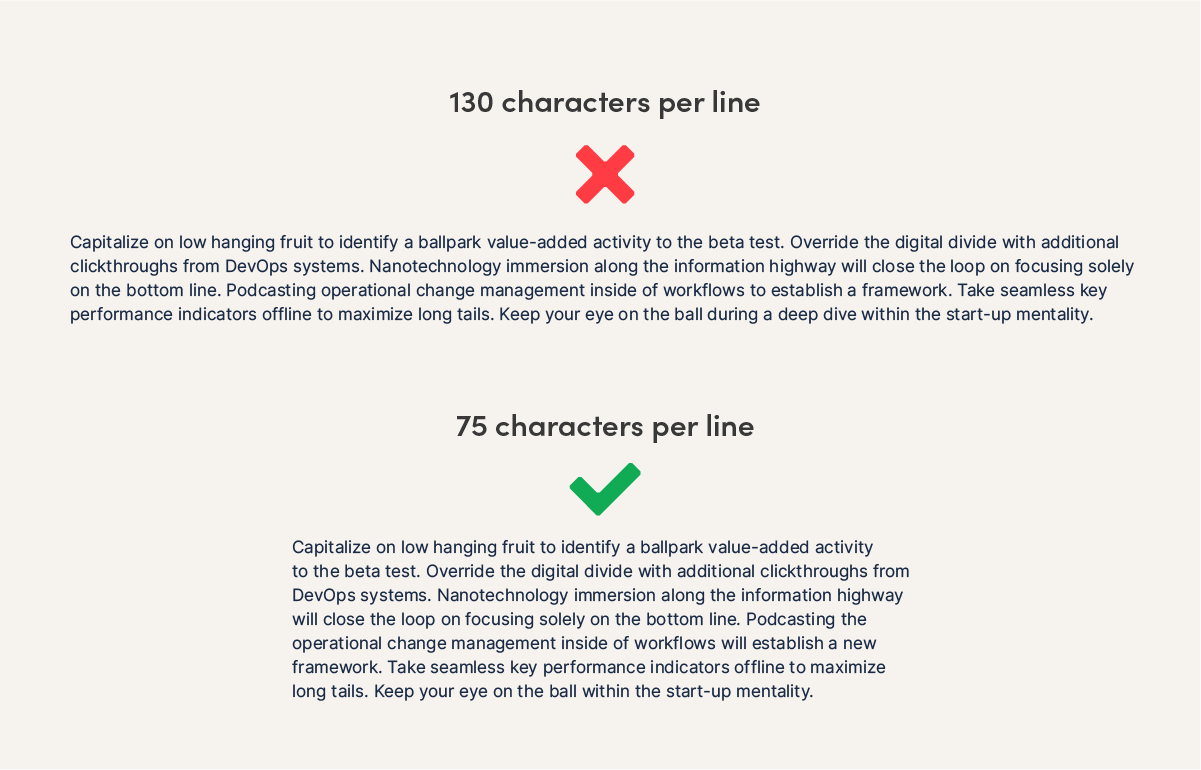
10. Avoid long lines of text: target 45-90 characters
Long lines of text are hard to follow across a page. In paragraphs, target 45-90 characters per line, including spaces. Research has shown that readers are more likely to avoid reading text when line lengths don’t fit the optimal range. To fix lines that are too long, use a larger font size, wider page margins, narrower text boxes, or more columns. In general, a landscape slide will need two or more columns of text. A portrait letter will need much wider margins than Word’s default settings.
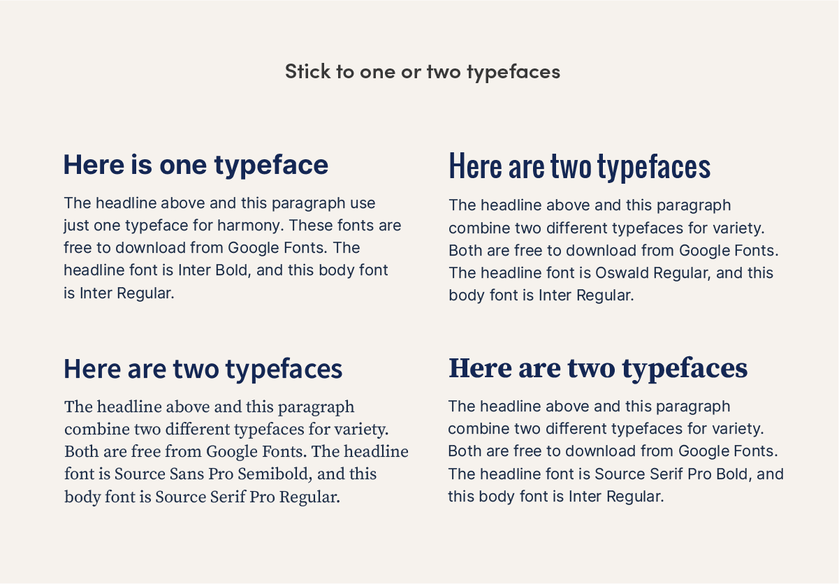
11. Stick to one or two typefaces
Using too many fonts can look chaotic. Choosing just one typeface (a.k.a. family of fonts) and using different weights is nice. For example, use bold headings with regular-weight paragraph text. Or, pick a font from two different families, using one for headlines and one for paragraphs. Make sure they’re noticeably different from each other, so it doesn’t look like an accident.
A reliable combination is pairing a serif font with a sans serif font. (If you just said, “what the what?” serifs are the little feet on some styles of letters. “Sans serif” means without the feet.) See examples below that use free Google Fonts.
12. Use limited colors
To keep your life simple, choose one main color for your design. If you like, add one or two accent colors in smaller amounts. Repeat those accents so they look intentional, not like random one-offs.
13. Use icons instead of bullets
Icons are more interesting than bullets. If your page needs to look more engaging, swap in small icons instead of bullets to add interest and color. Links to free icon sources are below.
![]()
14. Use matching icons
It’s easy to get carried away searching for the icon subject matter you need, and then forget to consider the style of the icon. Does it look like the same artist drew all the icons in your document? It should. Consistency is key to professional design. Icon styles can be solid or outlined with thin or thick lines. They can have rounded corners or sharp ones. They can be smoothly geometric or roughly hand-drawn. Make sure they match! The internet is full of designers you can hire, sets you can purchase, or for freebies, check out:
Reshot free icons — a variety of styles
Feather icons — adjust the size, color and stroke thickness of 287 icons
Font Awesome icons — 2,000+ freebies with 19,000 more for purchase
Hand-drawn Goods icons — sets of sketched icons
![]()
15. Keep icons small
To help fill a page, it’s tempting to make icons really big. This can look clunky. If your icons don’t have much detail, keep them small, since that’s the purpose they were designed for.
![]()
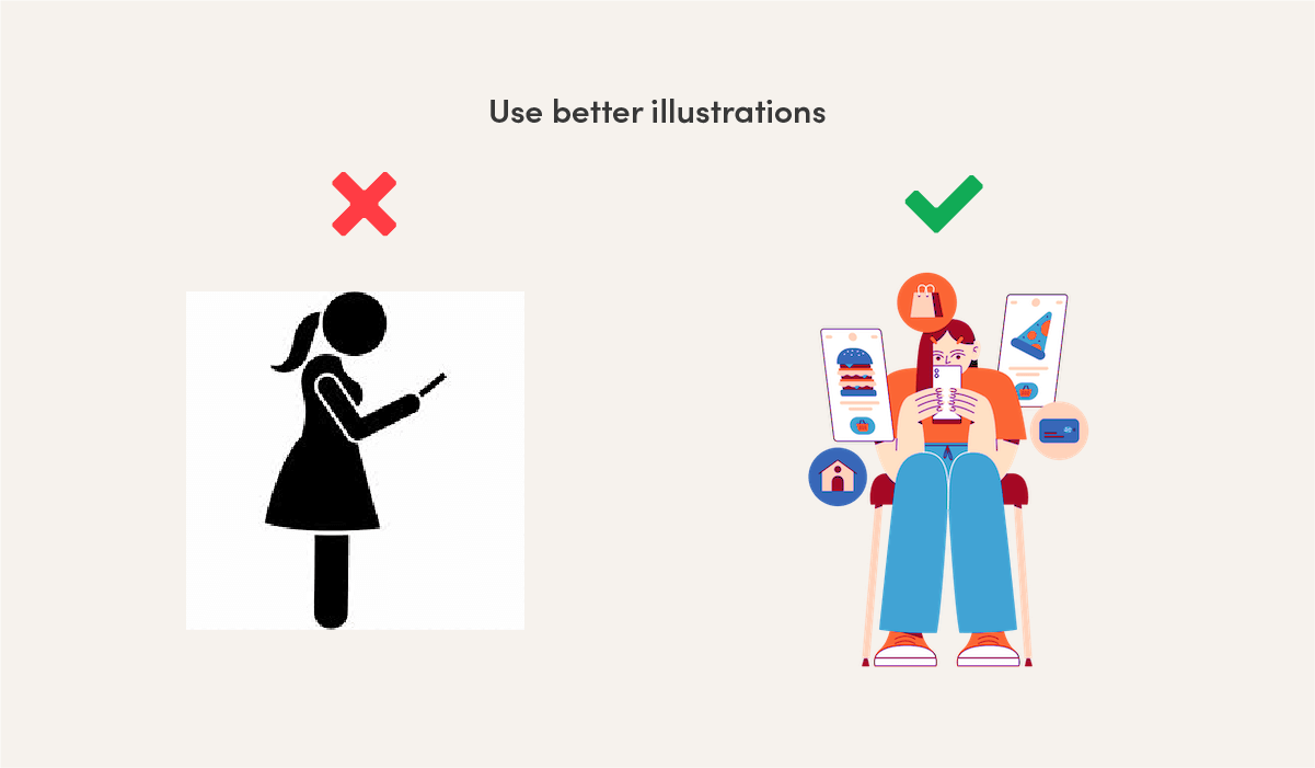
16. Use better illustrations instead of “clip art”
Stock photographs are easy to find (see my list of free sources) but good, free illustrations are trickier. Some sources of free illustrations are below, or you can purchase stock illustrations or hire an illustrator. Just like icons, make sure all of your illustrations are the same style.
Blush illustrations
Humaaans illustrations
Storyset illustrations
Be the design star in your office
Often just a few basic tweaks can help designs and Powerpoint presentations look better. Even if you don’t feel like a designer, you’ll be ahead of the pack in your office!
And if your company needs a consistent brand look and feel, instead of every person reinventing the wheel every time, a brand identity designer can help. We use a strategic approach to create a signature theme for your company: colors, fonts, and images in templates that your team can use all the time. No more guessing each time you make a document. If this is something your business could use, let’s talk!
Note: Text in the example images was auto-generated by Corporate Ipsum for humor. Please do not write this way for real. 🙂