Recently I stopped by a local music venue. Sipping my beer, I noticed a TV slideshow promoting upcoming events. A bold, black slide caught my eye. I am totally going to RON FEST!
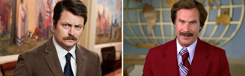
Hopes dashed. Turned out it’s Iron Fest. And this illustrates why logos that replace a letter with a picture can be tricky.
![]()
Organizations know they need a distinctive trademark. More than once I’ve heard, “We were thinking about what our logo could be. We want something creative-looking. So we thought that since we do XYZ, we could replace one of the letters with an XYZ!”
This can seem like a really good idea, but it’s hard to do well. Just ask American Carg or Chris Church. Unless Chris is a cult leader or has funded the new sanctuary and wants all the credit, we may have a communication problem.

Even if viewers can read a logo correctly, swapping symbols for letters can look clunky instead of elegant. Typographers design the shapes of letters to look visually balanced. Stroke weights and negative spaces are carefully calibrated to create a smooth flow. Inserting a picture into the beginning, middle, or end of a word interrupts that flow.
Placing a symbol between two words can work, since that’s where a natural break already exists. But be careful about sticking an image into a word. If you’re gonna go for it, here are a few suggestions.
The more whimsical the brand, the better your chance of success.
Embedding a symbol is a quirky approach, so make sure a playful logo will match the vibe of the company. If you’re a law firm or cyber security company, maybe don’t do it.
Put the symbol in the middle of the word, not at the beginning or end.
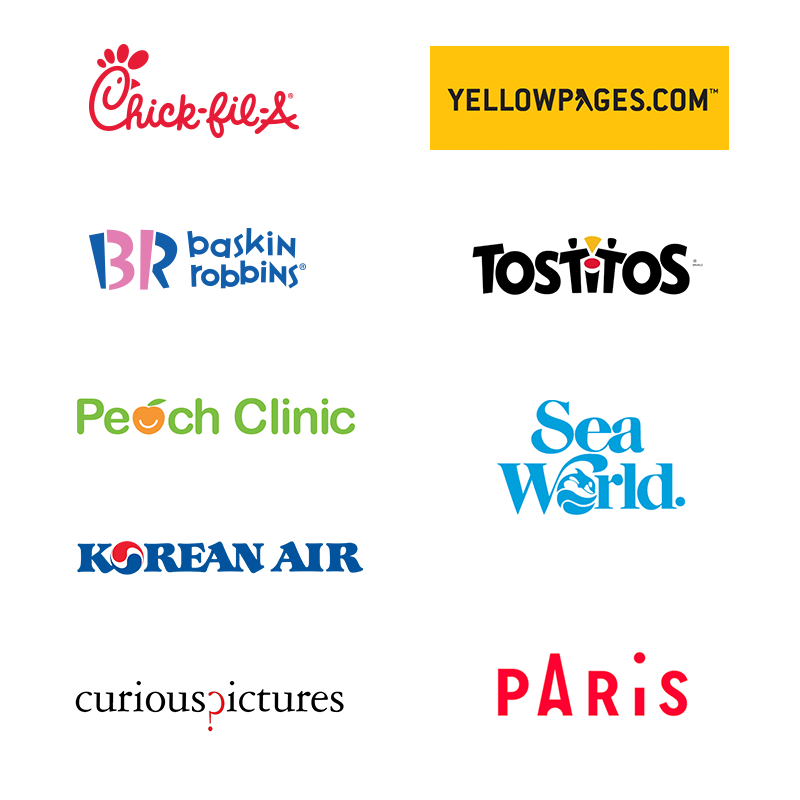
A picture will separate visually from the rest of the lettering, so it can make the first or last letter disappear. And then you’ve got a Chris Church or a Ron Fest on your hands. Put the symbol somewhere in the middle of the word, so it doesn’t trip up comprehension. If you do want a special first letter, try adding something to the letter instead of replacing it altogether. See the Chick-fil-A logo, where preserving the entire C keeps it readable.
Make sure the symbol’s style matches the rest of the letters.
The smile in the nicely-proportioned Peach Clinic peach echoes the bottom curve of the “e” and “c.” Curious Pictures repeats its “c” backwards to form the question mark. Paris’s Eiffel tower makes a couple tweaks to a capital A, and Sea World’s wavy “o” borrows the same swashy style of the S and W. The goal is cohesiveness.
Logos that replace a letter with a picture can work—but only for certain brands, and only sometimes. Use caution!
Other collections of logos
If you adore looking at logo roundups, also check out:
- Logos for super long company names (or, how to make your designer cry)
- Logos with “the” in the name (“the” can be annoying to deal with)
- All-lowercase logos (should you or shouldn’t you?)
- Logos that are someone’s last name (examples for clients)
- Types of logos 101 (the main categories)