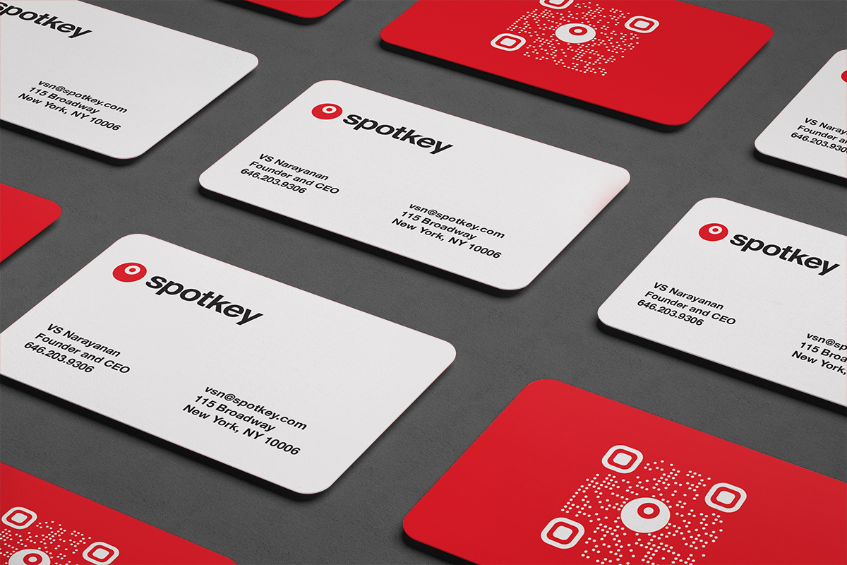
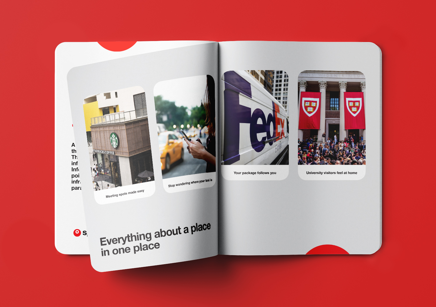
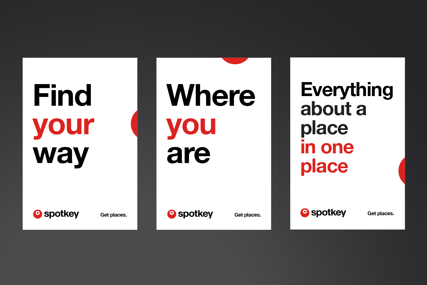
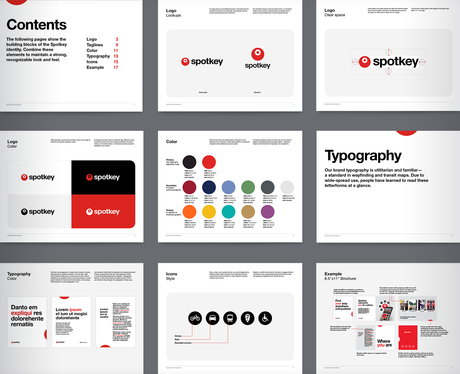
A brand identity for the tech startup Spotkey. This digital technology required a confident, minimal, and universal style. Black is timeless, while red is eye-catching. Spotkey helps people find each other, and no color is better at proclaiming “here I am!” than red. A roving red dot represents a changing location.
Typography is the utilitarian and familiar Helvetica, a standard in wayfinding and transit maps. Over decades, people have learned to read these neutral letterforms at a glance, making it the right choice for a brand aiming for streamlined functionality.