Here’s a case study showing my process from a blank slate to a finished logo.
The client, Uncorked, is a wine and beer retail store with a tasting bar opening soon in Chevy Chase, MD. They shared with me their lovely architectural renderings of the new space and requested a logo to fit with that vision: something simple, clean, and modern. They’ll expand to more locations and will use the same branding throughout.
I kicked off the project by giving the team homework: a worksheet with short-answer questions and clickable multiple-choice options. (Read more about the content in the Discovery Phase of my process.) It’s an efficient way to help me get to know the brand. And the exercises help the client give language to aspects of their business they maybe haven’t articulated before. The answers serve as a creative brief we can refer back to.
Reading the responses is one of my favorite parts of a project. It’s as if the brand becomes my new friend. I always get excited and start picturing how the company could really shine. The Uncorked guys did a great job with their answers and were very clear and consistent.
Then I summarized the key ideas, made a list of follow-up questions, and searched the internet for logo examples to discuss together. I picked samples based on content and style, showing general approaches that could work for this project. I always include some examples that I think won’t be quite the right direction, because I want to confirm this hunch with the client. It’s just as helpful to know what not to do.
We had a screen-share Zoom chat to get aligned: we needed a logo that is sophisticated, but also inviting and friendly. At home in an upscale environment, but not pretentious. Not overly ornate, but not cold and sleek, either. With a symbol that could be used separately from the wordmark.
I went to work.
These were my initial ideas for Uncorked. There were glasses arranged into a medallion-like symbol. The glasses could be wine glasses or snifters, since the shop will sell a variety of beverages. I also thought about a corkscrew, either straight like an underline (which could be used as a decorative element throughout the branding) or wrapped into a circle. Or what about a corkscrew hidden inside another shape, like a flower? Or some decorative initial U’s with a botanical vibe.
For each concept I showed the main logo, reversed options, vertical and horizontal lockups, a social profile image, a secondary badge with location info, and a couple of real-world mockups. Sometimes a concept has a variation that could work instead—in this case, removing the stems from the glasses—so I included that option, too.
From the initial concepts, the team chose option 1a. We all liked how it was the right style, we could see glasses, and even imagine chairs around a table, highlighting the community aspect of the shop. There were a few edits the team wanted to see, just to make sure we had the best version of this idea. Perhaps rotate the symbol?
Or make the type more uniform in thickness, with less contrast between thick and thin strokes.
Or, what would happen if the symbol was altered to have a square instead of a circle in the center, or the glasses moved farther apart with less or no overlap?
How about a different green? The original was chosen to match tile in the new shop, but we also tested a darker and lighter green.
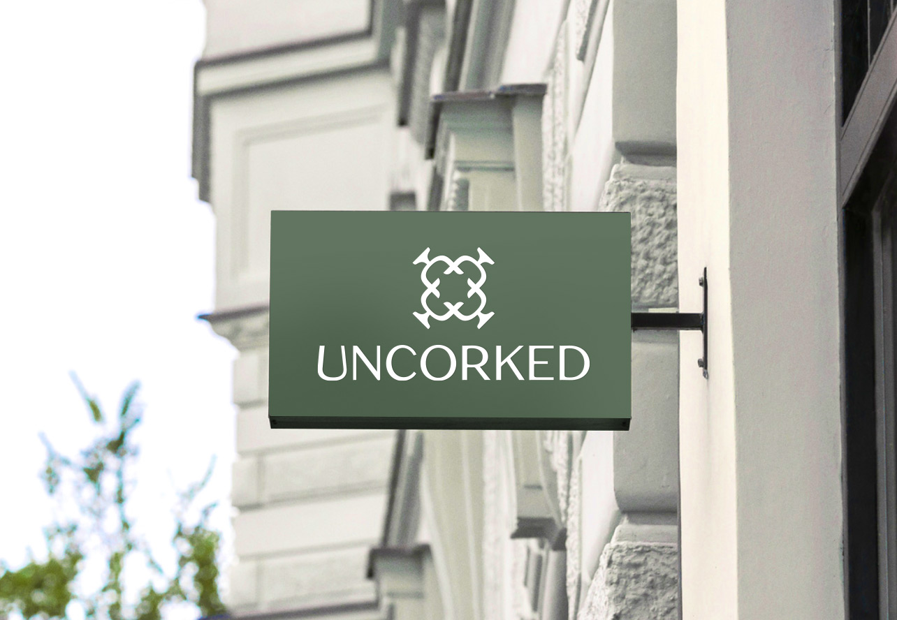
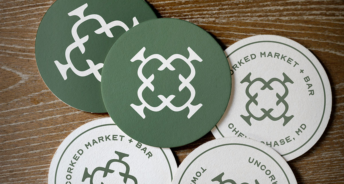
In the end, we kept most aspects the same as the original. We liked the thick-and-thin contrast of the original custom type, since it felt warmer and more elegant. The distinctive “U” that suggests a wine glass looked best that way. The green was nice, too. But we liked the symbol with the glasses pulled a little farther apart.
I added an extra file with a tagline in case more description is needed sometimes. Instead of listing “wine, beer, and tasting bar,” I kept it short and sweet. Less specific, in case products shift. “Market” sounds special and higher end, and “Bar” can have flexibility. The plus sign matched the shape of the symbol better than an ampersand did, and felt modern.
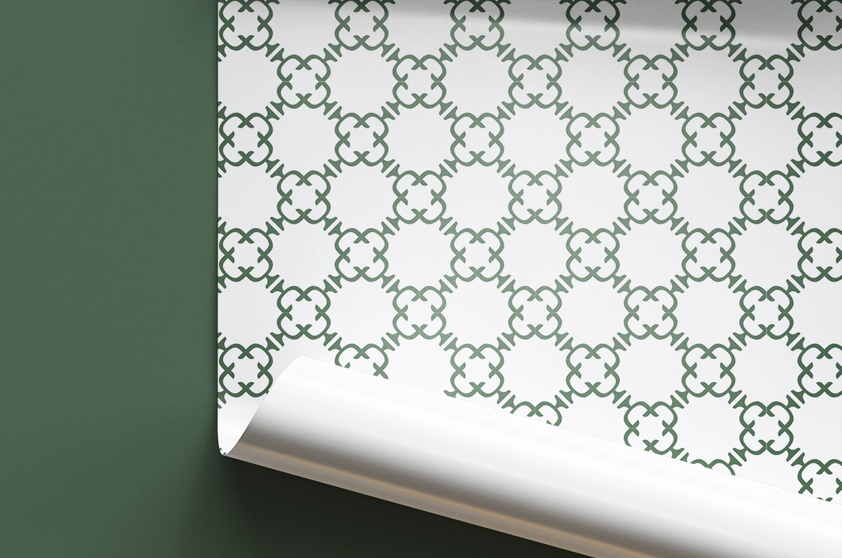
It wasn’t part of the project scope, but I couldn’t help making a repeating pattern, too. Brand patterns like this can be used on the back sides of business cards, inside envelopes and pocket folders, on shopping bags and wrapping paper, or as shelf liners or custom wallpaper.
It was a pleasure working with the Uncorked team, and we’re excited to see this brand come to life.