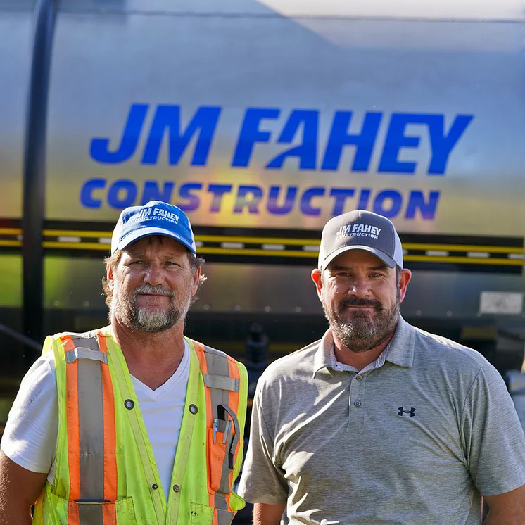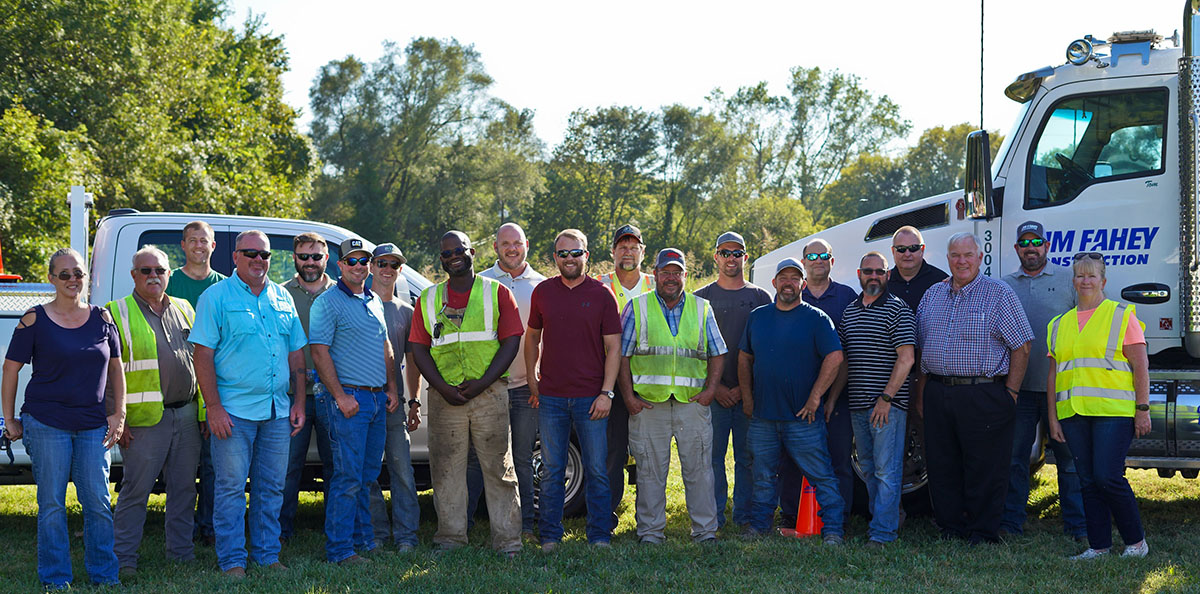
JM Fahey Construction is a family-owned company celebrating 50 years in Kansas City. They operate asphalt plants and build roads. If you’ve driven on a highway in Missouri or Kansas, there’s a chance this company built it. They aim for an employee-powered culture where people love coming to work, jobs are done with quality, and they can support their community.
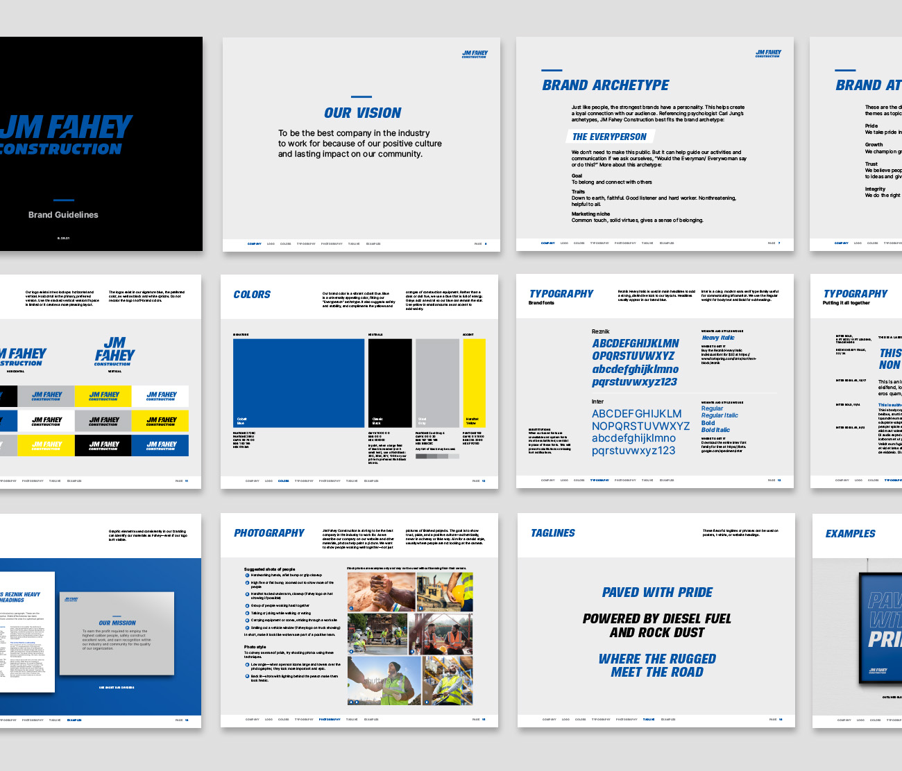
After 50 years, it was time for a better visual identity. Something more confident, recognizable, and consistent that everybody could rally behind. Nothing fancy or busy. Branding that would simply convey pride, growth, and trustworthiness.
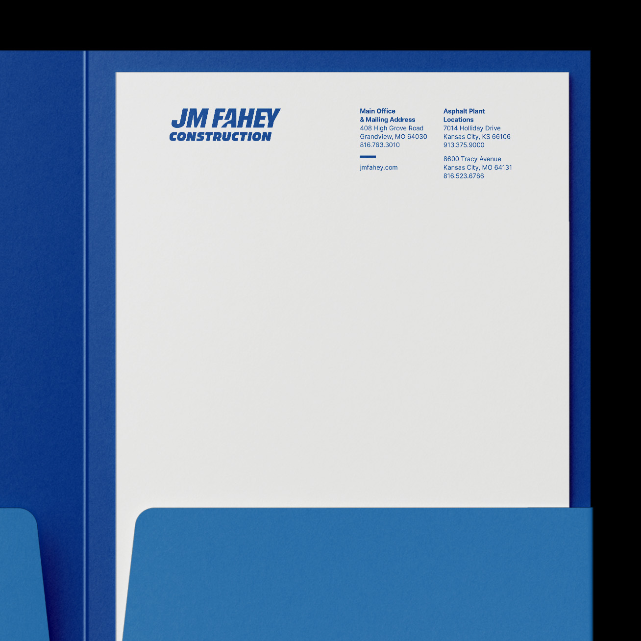
From among a few concepts, they picked this logo idea: bold, thick lettering with a forward slant. It represents leaning into future growth as a company, plus growth for individuals who are trained to become even more skillful. A road in the negative space references highways, and the strong blue stands for loyalty and safety. Blue also looks great with yellow equipment and safety vests.
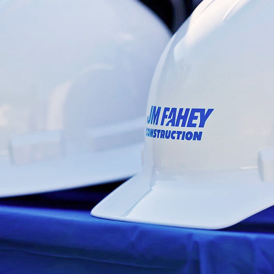
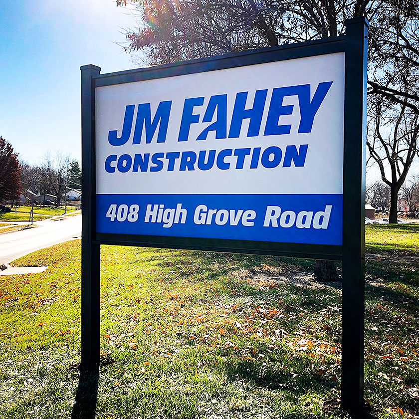
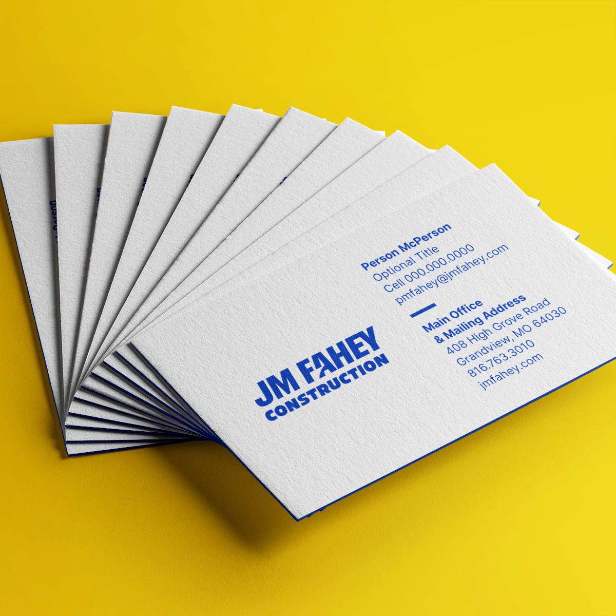
We added the “JM” and “Construction” to the logo for continuity and developed a style guide to help Fahey stay consistent with fonts, colors, and guidelines for taking photos.
Consistency had been hard to maintain in the past (examples below), but now Fahey can take pride in their upgraded visual identity.