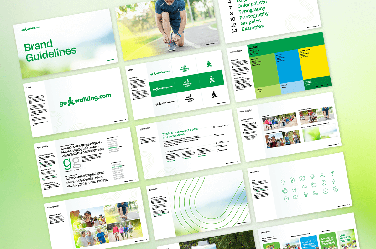
Gowalking.com is a growing global community of walking clubs. The brand will link the world’s 1.2 billion fitness walkers with an easy way to find a nearby walking group—just search the database. Everybody can enjoy the physical and mental benefits of walking with others. It’s a great way to meet new people when you’re lonely or new to a city, take a break from screens, and get some fitness accountability.
This new brand needed a logo that feels universal. And it needed a simple, recognizable visual theme.
The gowalking.com symbol is a walking person. This universal-looking character is designed to be any gender, age, or ethnicity. Our walking human is not too thin and not too stout—a sturdy person, striding along. The boldness of the symbol and lettering help the logo stand out on materials. Since the logo is the website URL, it acts as a call to action to visit the site.
If you’re into details, note that the roundness of the little person’s head is echoed in the dot on the “i” and the period. The distant arm aligns with the x-height of the “w.” It’s things like this that make logos well-crafted.
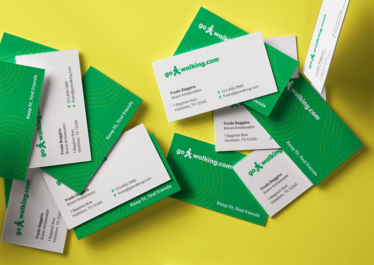
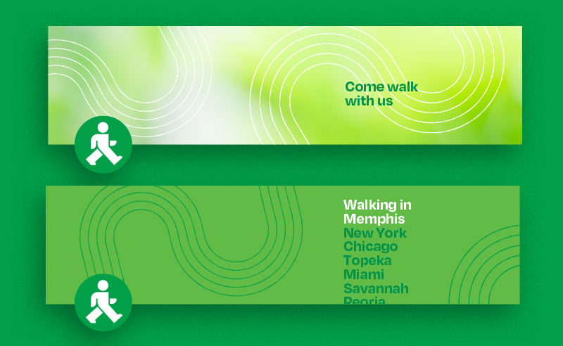
Parallel lines curving through layouts represent the paths of people walking side by side. They also work as a graphic element to lead your eye through designs. The lines have a sketchy quality to hint that they’re made by humans, as opposed to being perfectly smooth and mechanical.
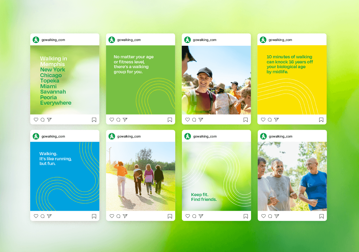
The brand color palette is a happy mix of green, blue, and yellow—like grass, blue sky, and sunshine on a spring day. This brand aims at mass appeal. We want a broad audience to feel energized and inspired. Get out and be active!

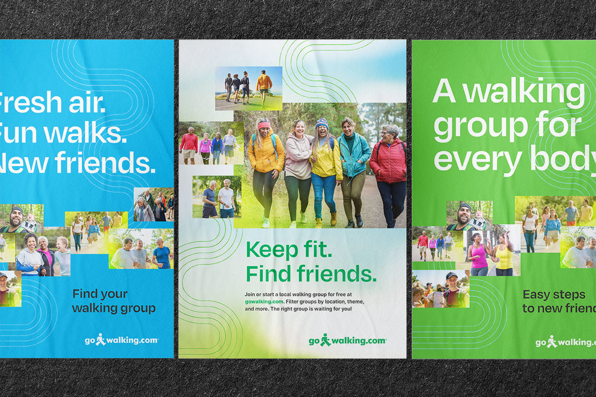
Materials show a variety of age, gender, and ethnicities. The primary audience leans older, so plenty of 50+ adults are featured. But younger people enjoy walking, too, so they’re included in the mix. We show people having a good time, and sometimes add a warm yellow glow to symbolize the pleasure of enjoying social time with other humans in the outdoors.
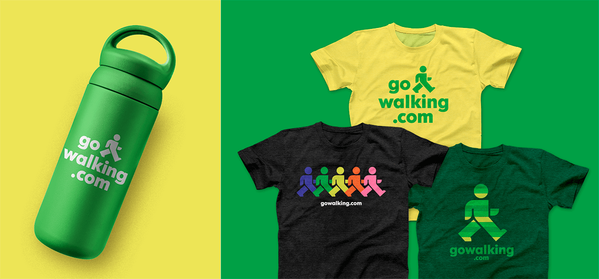
We also envisioned some branded just-for-fun products, one with a reference to the Grateful Dead dancing bears. If you know, you know. And if you don’t, it’s a cute rainbow shirt.
A brand style guide documents all of the elements, from fonts (shout out to Degular and Inter), to colors, to how to choose photos, and examples of how to put the parts together to stay on brand. The team can use this as a guide for their web developer, any sponsors and partners, and themselves, to keep everything looking consistent.