Chromatic builds web apps and platforms, designs large systems, and untangles gnarly digital problems. Besides their technical expertise, this crew has a really special company culture. They knew their old branding was muffling their strengths. Materials didn’t emphasize important points. Visuals felt dull and clunky, the opposite of the company’s personality. They were due for a brand refresh.
First we needed to clarify who they are, what they stand for, and what they’re ultimately offering customers. Mentally the group was already on the same page, so some exercises helped get it out on paper. Then we translated the insights into a visual identity they could run with.
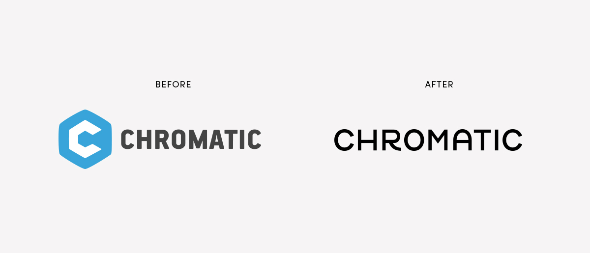
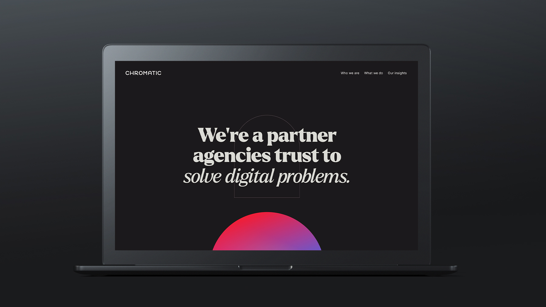
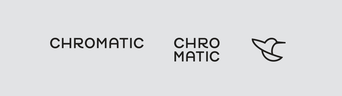
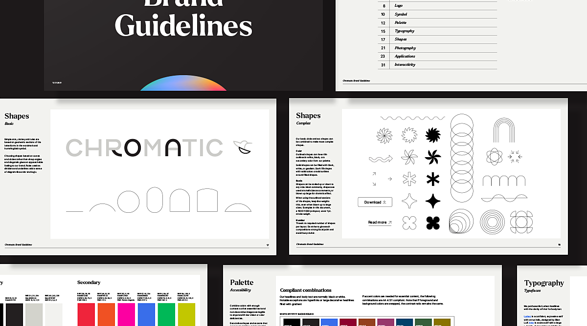
To streamline, we ditched the wrench-like symbol. Chromatic is a rational, technical, intelligent brand, so we created a clean, geometric wordmark. The curved-leg R and arched A add friendliness, hinting that they’re also warm, accessible mentors.
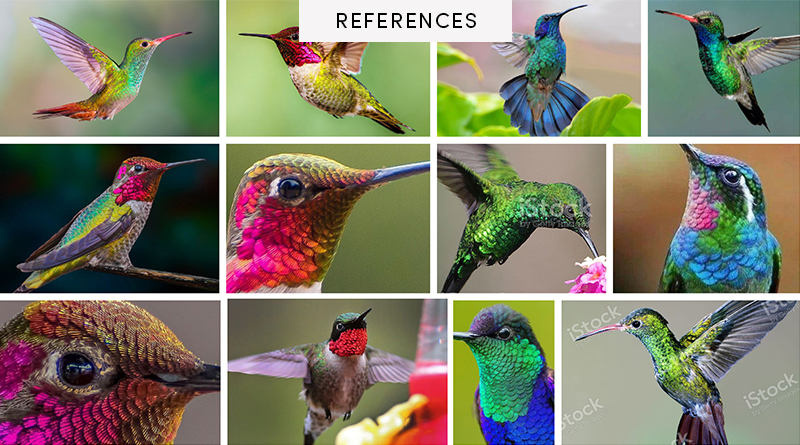
Along with a wordmark, we liked the idea of having a brand symbol. A hummingbird was perfect:
For the hummingbird symbol, I matched the wordmark’s style and gave it a subtle C shape for Chromatic.
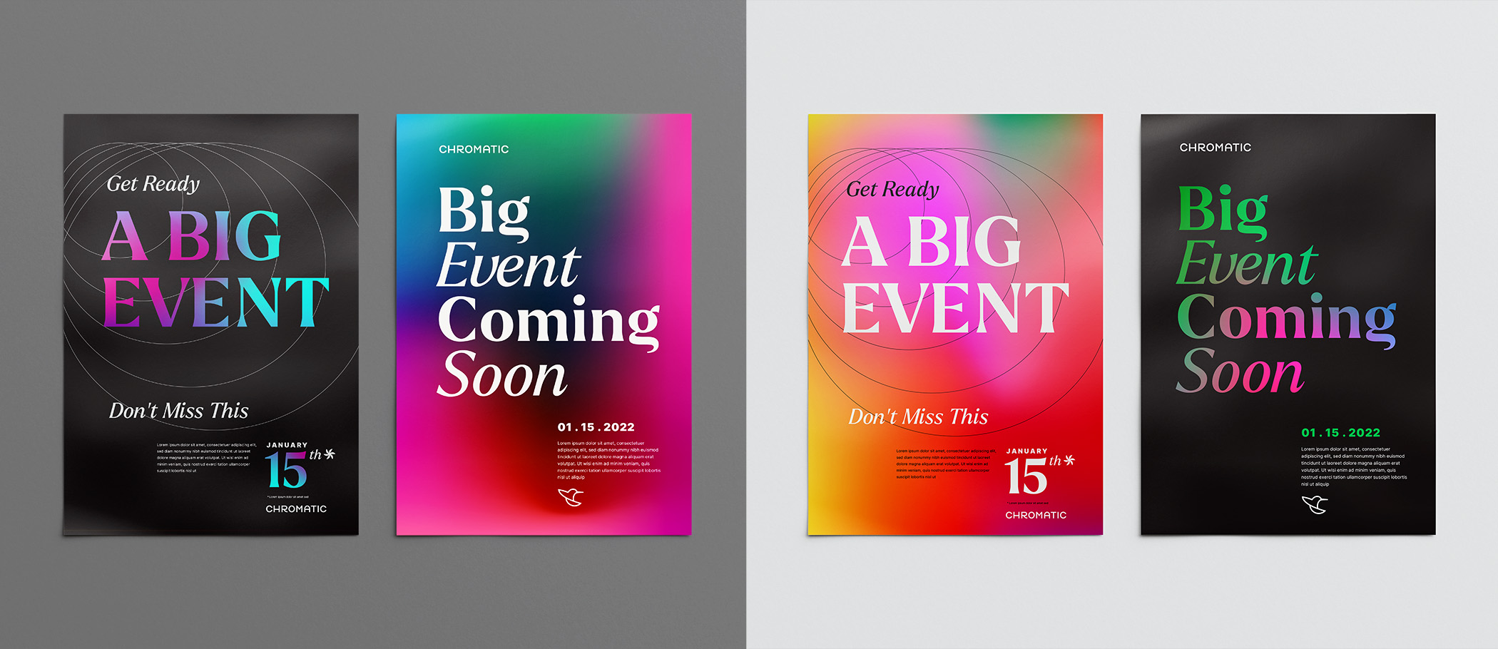
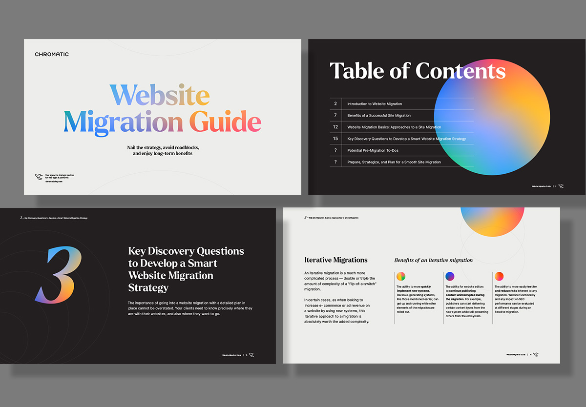
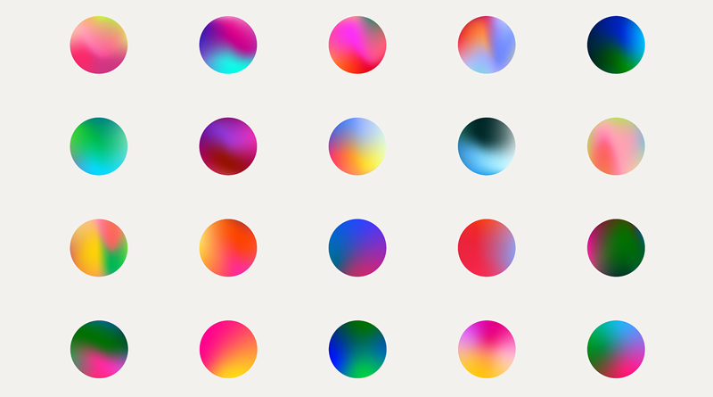
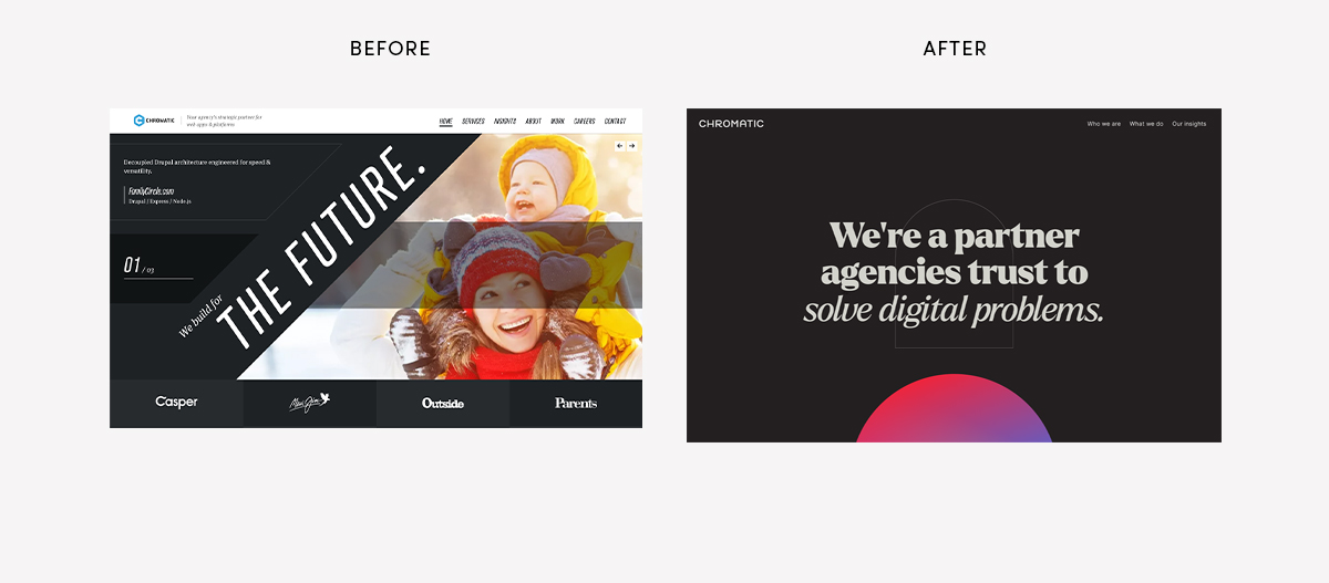
Jewel-toned gradients inspired by hummingbirds are used throughout the brand refresh. The typefaces Larken and Inter work together for elegant impact combined with informational clarity.
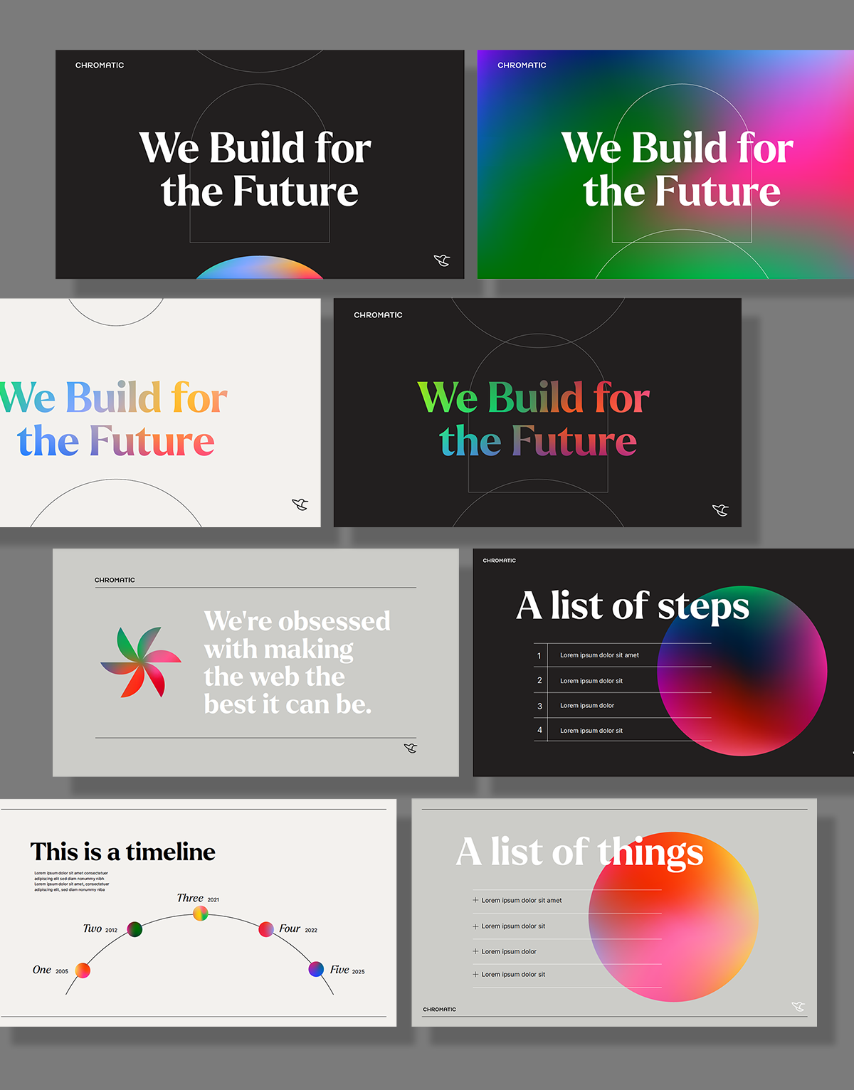
We made also made a set of shapes inspired by the geometry of the logo. The shapes imply structure and organization, at which Chromatic excels. The “wireframe-y” style implies technology. These can be used separately, layered, or animated to convey different concepts.
All of these elements are fun to play with. Check out the award-winning website that Chromatic designed using the new identity, and enjoy the animations.
Words from the client that made my day:
“We revealed the new branding at our team retreat a couple weeks back in our annual State of Chromatic presentation and whoooo boy did everyone LOVE IT TO PIECES! It is doing exactly what I hoped it would internally: reinvigorating the team about who we are and what we are all about.”