Headquartered in Montreal, Shifu aims to become a recognized brand throughout North America for Chinese quick-service food.
In English, Shifu means “master.” The name was chosen as a tribute to Mr. Ping, who started his journey as a dishwasher, eventually opened his own restaurant, and after a 30 year career, passed the reins to his sons and friends. They’re ushering in a new era with eco-friendly operations, modern technology, and a new restaurant name and branding.
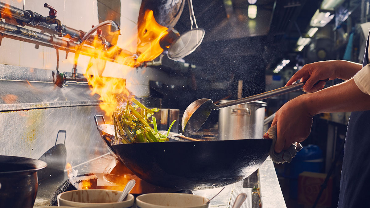
The team came to me with a chef logo they already had. They were open to evolving it a bit. But we decided this didn’t feel like a modern enough solution, and didn’t help to break stereotypes associated with Chinese food and customer service. A better idea: in Cantonese cooking, fire creates “the breath of the wok” (wok hei), and Shifu’s namesake chef rules this element in the kitchen. So instead, we went with an “S” crafted to suggest fire and movement.
The Shifu block lettering is geometric and modern, but still references Chinese calligraphy so people will know it’s a Chinese restaurant.
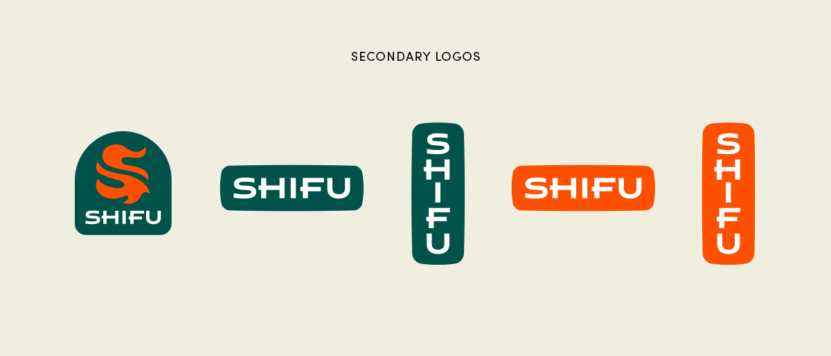
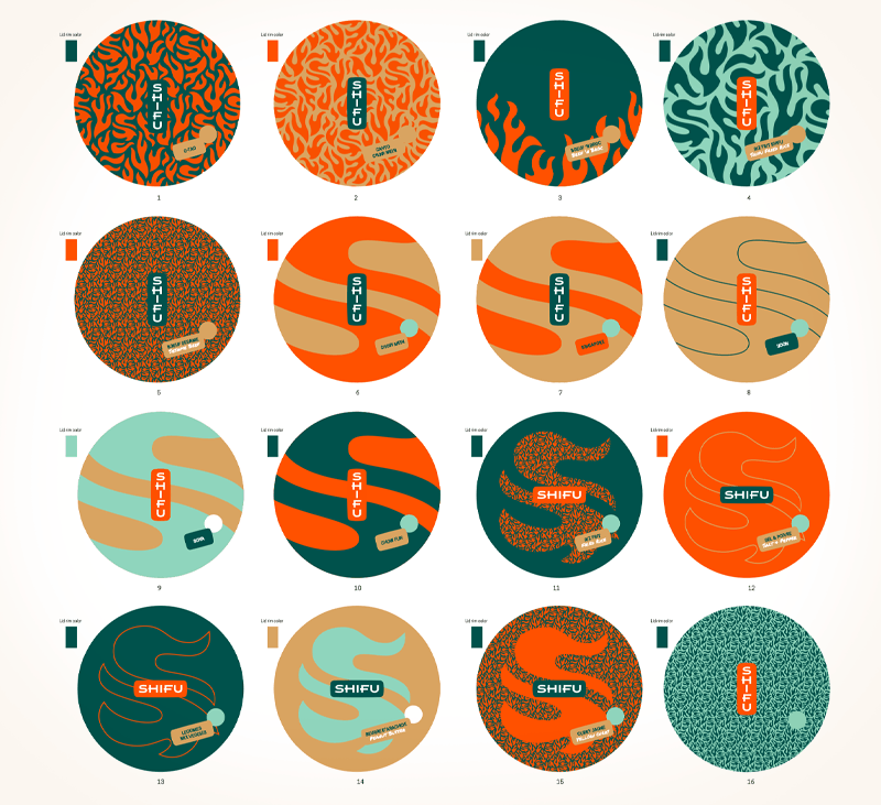
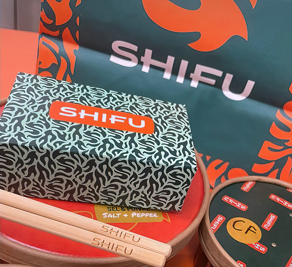
A set of secondary logos with enclosures holding lettering are useful for making branded materials. They appear throughout patterns and packaging.
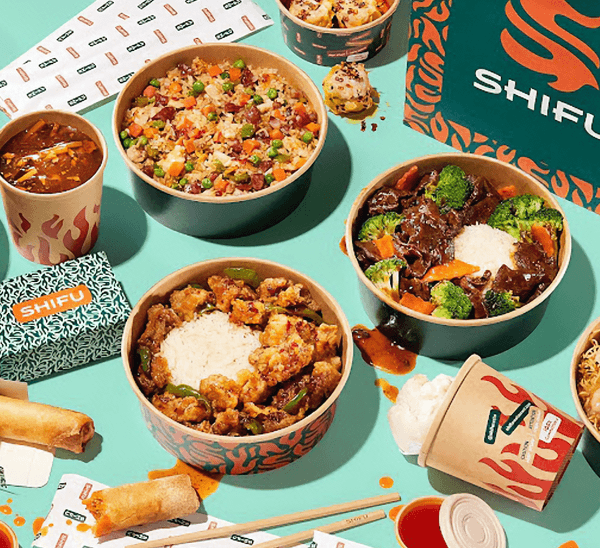
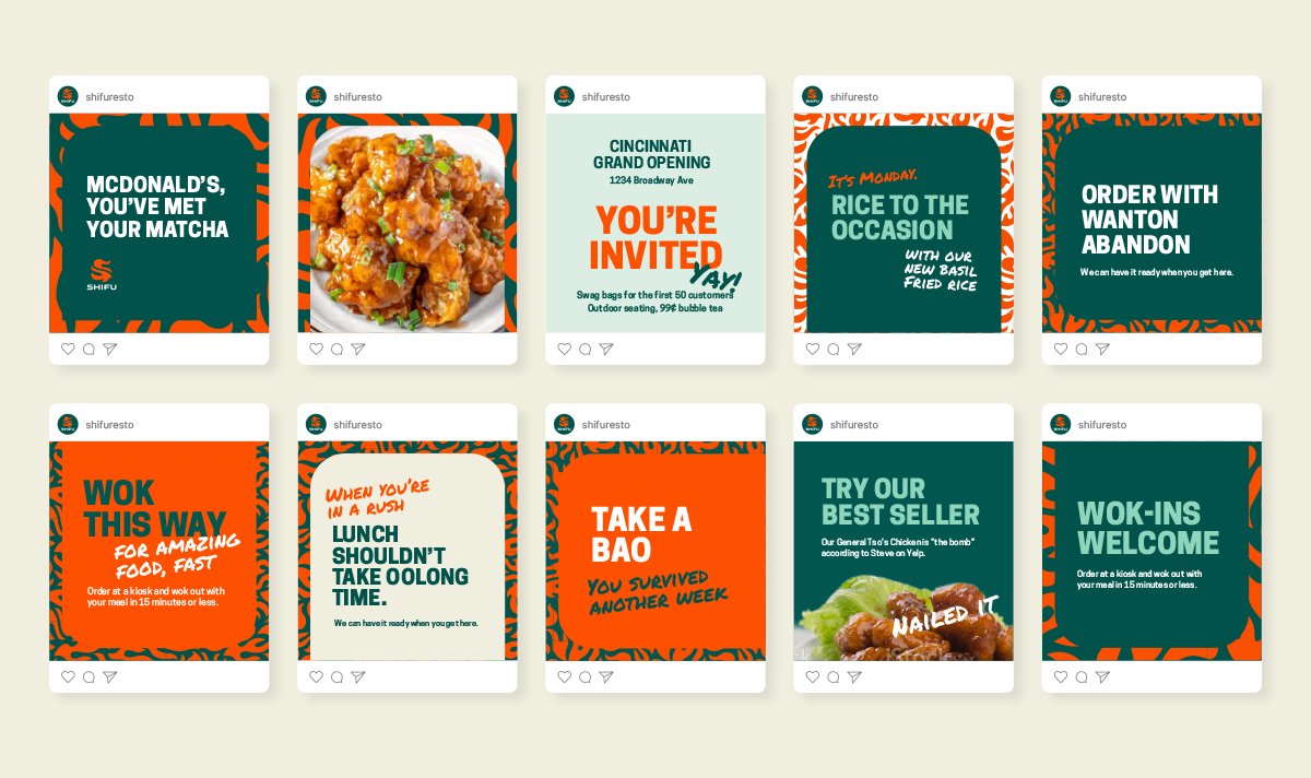
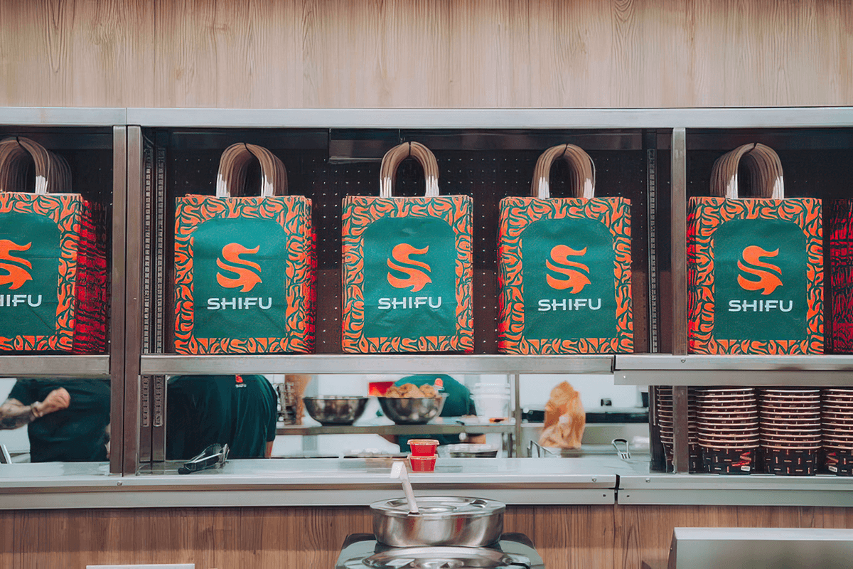
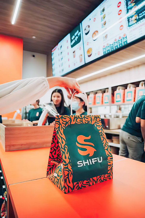
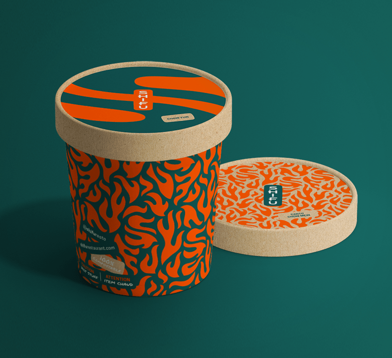
The green and orange color palette is designed to stand out from typical red and black Chinese restaurant design. And it looks great in food photos.
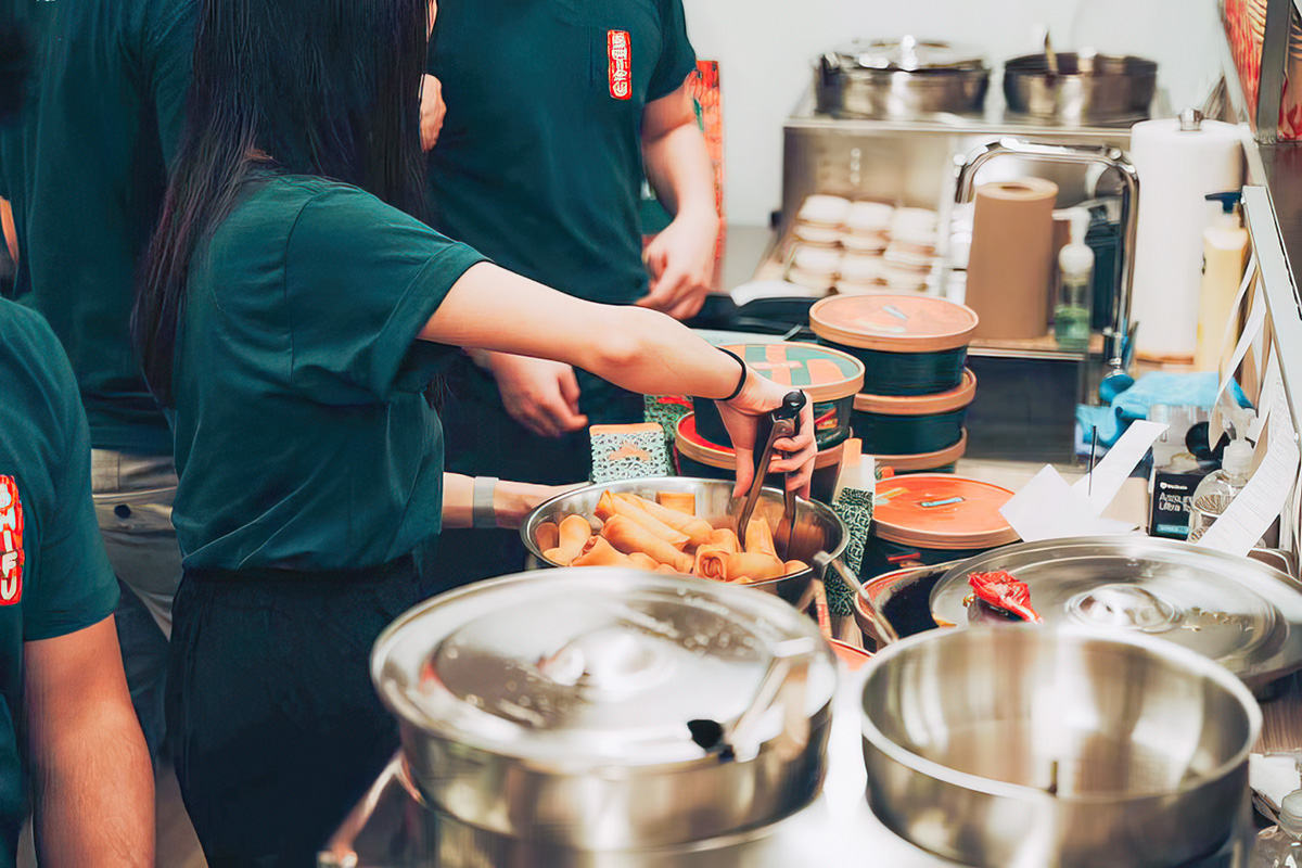
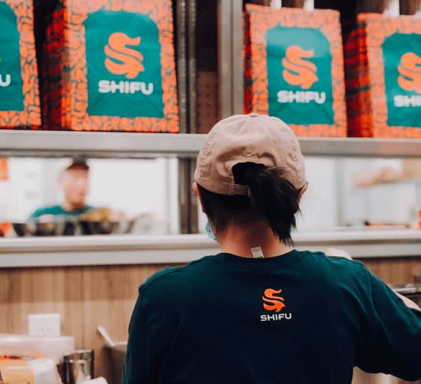
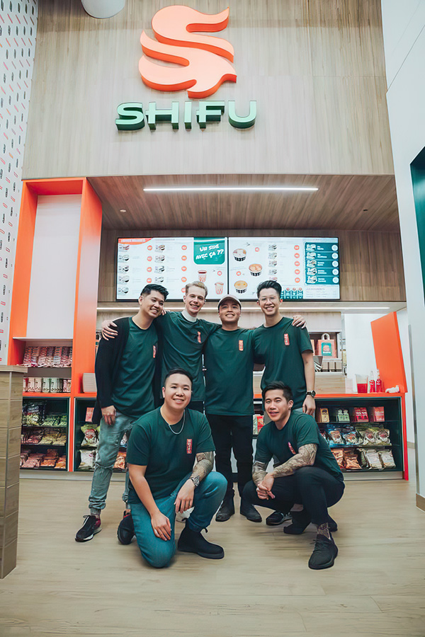
Store photos by @senpaimedia
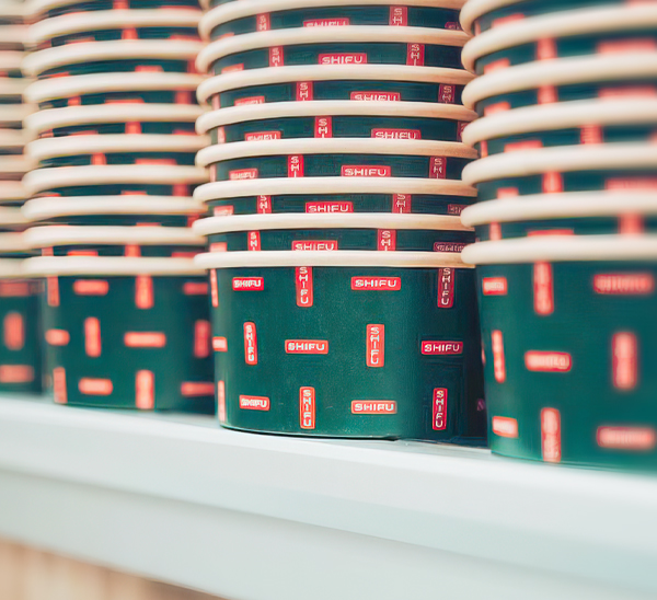
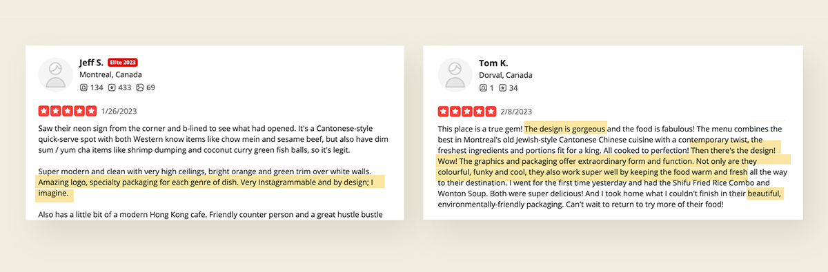
Shifu’s store wallpaper, cartons, boxes, and lids feature a signature fire pattern that includes hidden Shifu “S” logos. A dozen different lids can be mixed and matched with various bottoms to create a riot of orange and green takeout boxes. They were designed to be super photogenic. It worked—customers immediately started posting pictures on social media and mentioned the packaging in Yelp reviews.
Mockups of sample social posts feature some copywriting fun. I wrote examples they can riff on, to showcase this brand’s playful, energetic vibe.