The University of Washington’s Institute for Protein Design (IPD) is the first of its kind, founded with the aim of designing a new world of synthetic proteins to address challenges in medicine, energy and technology. The institute came to me needing a distinctive logo of its own that harmonizes with the University of Washington’s new branding.
To start, I surveyed standard illustrations and diagrams that researchers are used to seeing. I learned that the current way of representing the 3D structures of proteins was developed by a scientist named Jane Richardson. Her illustrations were the jumping-off point for the logo development.
Some early ideas:
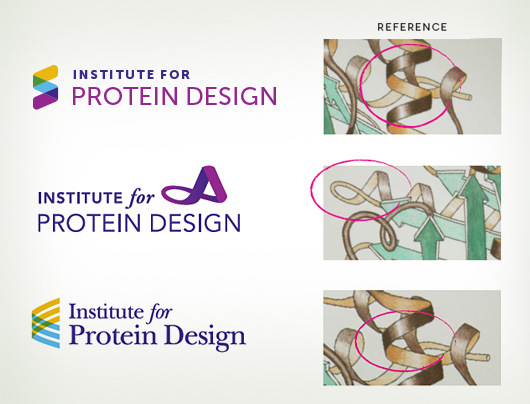
Because a logo should be a simple tag or identifier for an organization, not a detailed illustration, our goal was a stylized mark that’s eye-catching, clean, and can be easily reproduced at large and small sizes. The first option above had the best response, but was deemed too much like a DNA helix.
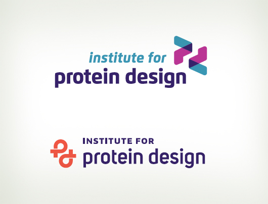
So I kept the colorful, transparent, folding effect but turned it into a “p” for “protein.” We experimented with flipping the “p” over to add a “d” for “design,” and I also drafted another version of a “pd” made from looping shapes.
We also evaluated four potential color palettes that included the UW’s signature hue, a dark blue-purple.

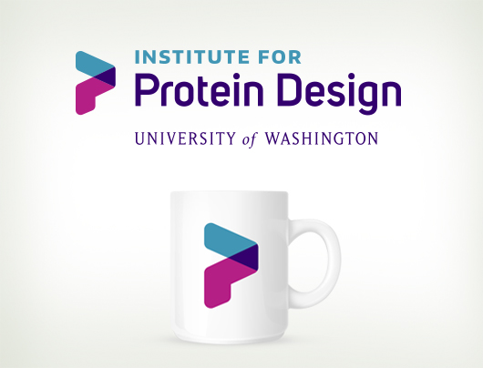
In the end, the single “p” won out for its simplicity and was paired with the university’s brand typography. The violet and blue color scheme was selected to coordinate with the school’s tertiary palette for a fresh, energetic new look.
![]()