![]()
When people contact me about a branding project, they often have a scope in mind: a logo, fonts and colors, maybe a business card. It makes sense. Those are tangible things you can picture.
Whether that’s the scope that will serve them best depends on the situation.
The real challenge isn’t assets, it’s consistency
A logo, color palette, and font choices are important, but they don’t automatically create a recognizable brand. The real challenge is making sure that everything your business produces feels like it belongs together.
Without an established visual “language,” as branding people like to call it, two designers using the exact same logo, colors, and fonts will create work that looks unrelated.
That’s why a key question isn’t just “which graphic elements do I need?” but also, “does a visual system already exist, or are we building it from scratch?”
When a logo is enough
A logo-only project makes sense when a brand identity system already exists. Colors, fonts, and images are working; the brand’s look is established. The logo is the one not-so-good piece that needs to catch up.
I’ve seen this sometimes. A company was in the middle of a website redesign and realized their logo was the weak link. Everything else looked great. Their web firm didn’t handle logos, so they brought me in to redesign just that part. Other times, companies were acquired or spun off and needed their logo updated to reflect the change. Sometimes a company was about to release a new product or service, and it needed another logo created to fit within the brand theme.
In these cases, the underlying identity system already existed. Only the logo needed work.
When logo-only doesn’t work so well: when there’s no system at all. When you’re starting a business, it’s tempting to get just a logo out of budget caution, or the need to feel like you’re making progress. But a logo without a visual system around it has nowhere to live. The people who go on to build your website, design your deck, or create your marketing materials will start making their own decisions about colors, fonts, spacing, and style—decisions that may have nothing to do with the thinking behind the logo. Within six months, your brand can look like it was made by a bunch of different people.
![]()
These layouts all use the same logo. But they go in a lot of different directions.
When logo, colors, and fonts are enough
Adding colors and fonts is an important step. Now there’s a palette and some typographic flavor to work with. But colors and fonts alone still don’t provide enough direction to make layouts.
Sooner or later, someone will ask: How should this actually look? How should I arrange this page? What kind of pictures do we use? How do we make everything consistent?
What’s missing are supporting graphic elements and usage examples to follow. Shapes, patterns, textures, illustration style, and photography direction, applied to samples. Without them, different designers given the same logo, colors, and fonts can produce great work, but it won’t look like it’s from the same company.
![]()
These layouts all use the same logo, color palette, and typeface (Figtree). That still leaves a lot of room for variation.
The logo-colors-fonts scope can work in one specific situation: when you’re going to plug your branding into a template-based system—a website builder, a pitch deck theme, a design platform—that has already handled all the design and layout decisions for you. This might be a Squarespace or Shopify website template, a Google Slides theme, a Substack or Flodesk newsletter template, or LinkedIn carousel templates in Canva. The template provides the structure; adding your own logo, colors, and fonts provides some customization. If the template is going to do the heavy lifting, you may not need a full identity system.
But if you’re planning to create your own materials from scratch, work with a variety of designers over time, or build a brand that has a custom look that’s distinctly yours, this scope will still leave things unresolved.
When you need a full brand identity system
This is the scope most businesses need when they’re building a brand from the ground up, rebranding, or at a stage where consistency across materials is important.
A full brand identity system answers the “how do I put this together” question. It includes the logo, color palette, and fonts. Plus more elements that will give the brand its distinctive look: textures, patterns, shapes, photos, illustrations, icons, etc. It often includes messaging and brand voice direction. It should include examples showing the whole theme applied to real situations: on a website, a presentation deck, some social posts, a piece of signage. Those samples aren’t just nice to look at. They’re how you and anyone who works on your brand can see the system in action and understand the pattern.
When this is captured in a style guide document, the result is something any designer, developer, or marketing person can pick up and work from. They can see the design language fleshed out enough to replicate it.
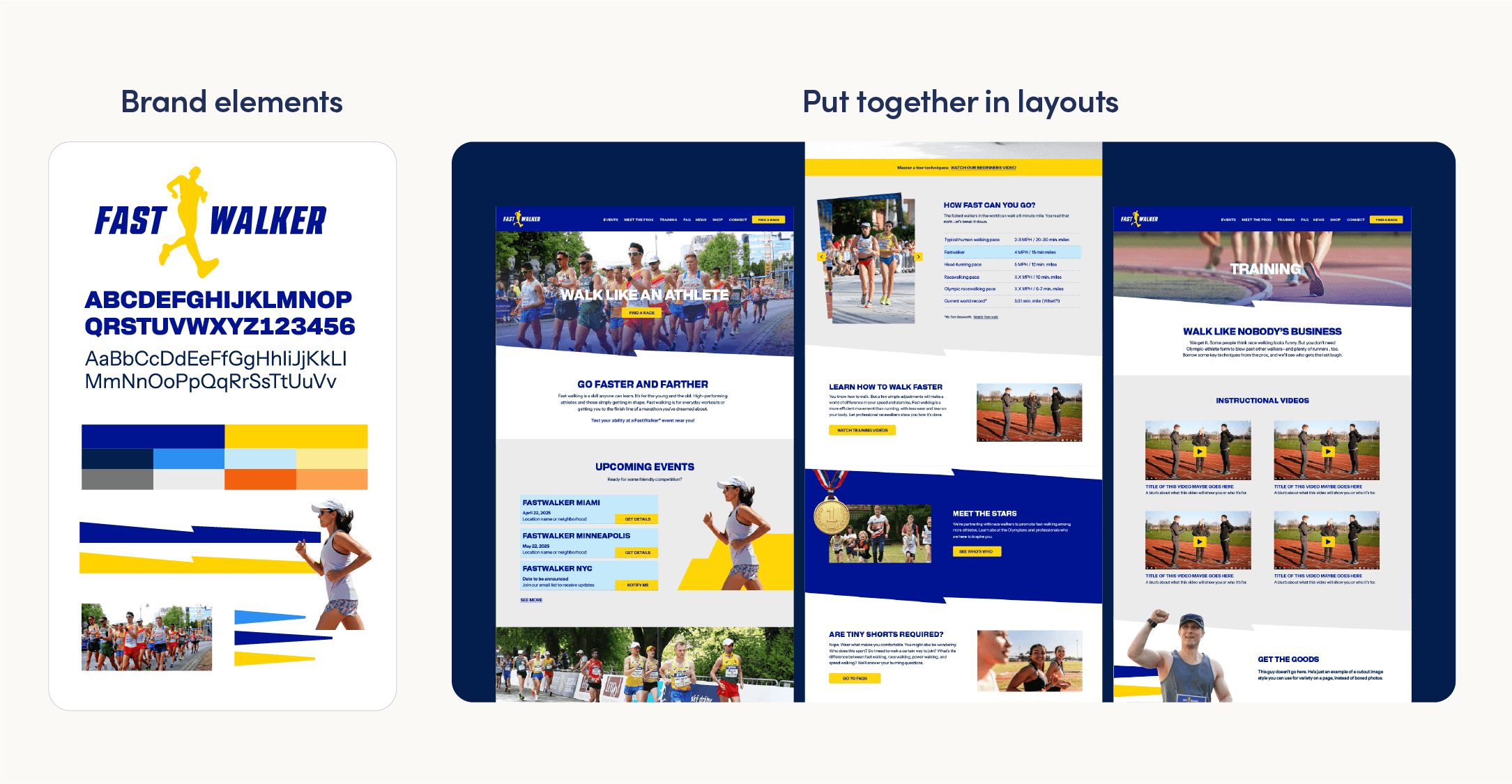
A thoughtful brand identity has a set of brand elements with examples that show how to use them.
How to decide your branding project scope
Ask yourself: does a consistent visual system already exist for my business?
If yes, and the logo is the only weak piece—just a logo may be right.
If yes, because you’re working within a template that handles layout for you—logo, colors, and fonts may be enough.
If no—you’ll need a full identity system. Starting with less may be cheaper today, but rebuilding an inconsistent brand later is usually pricier than doing it carefully the first time, since so many materials will need to be redesigned.
If you’re not sure what your business needs, get in touch. I’d be happy to ask a few questions and point you in the right direction.