Halo is a family of brands serving children with developmental needs. The founder approached me to help create a brand identity for this pediatric practice—one she wished had existed when her own family needed it.
Halo aims to be a complete resource for therapy, academic classes, and qualified childcare. They believe families benefit most from a full team of experts who work together.
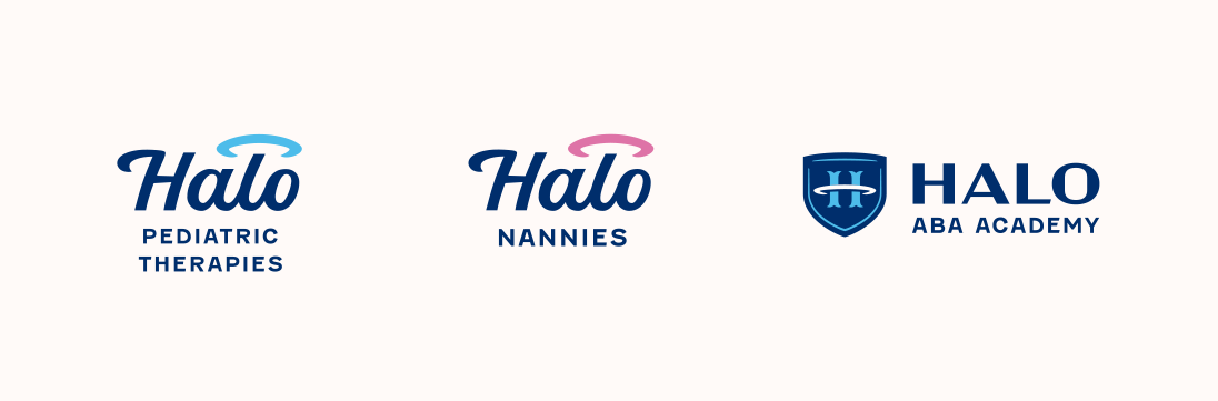
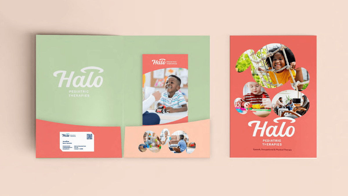
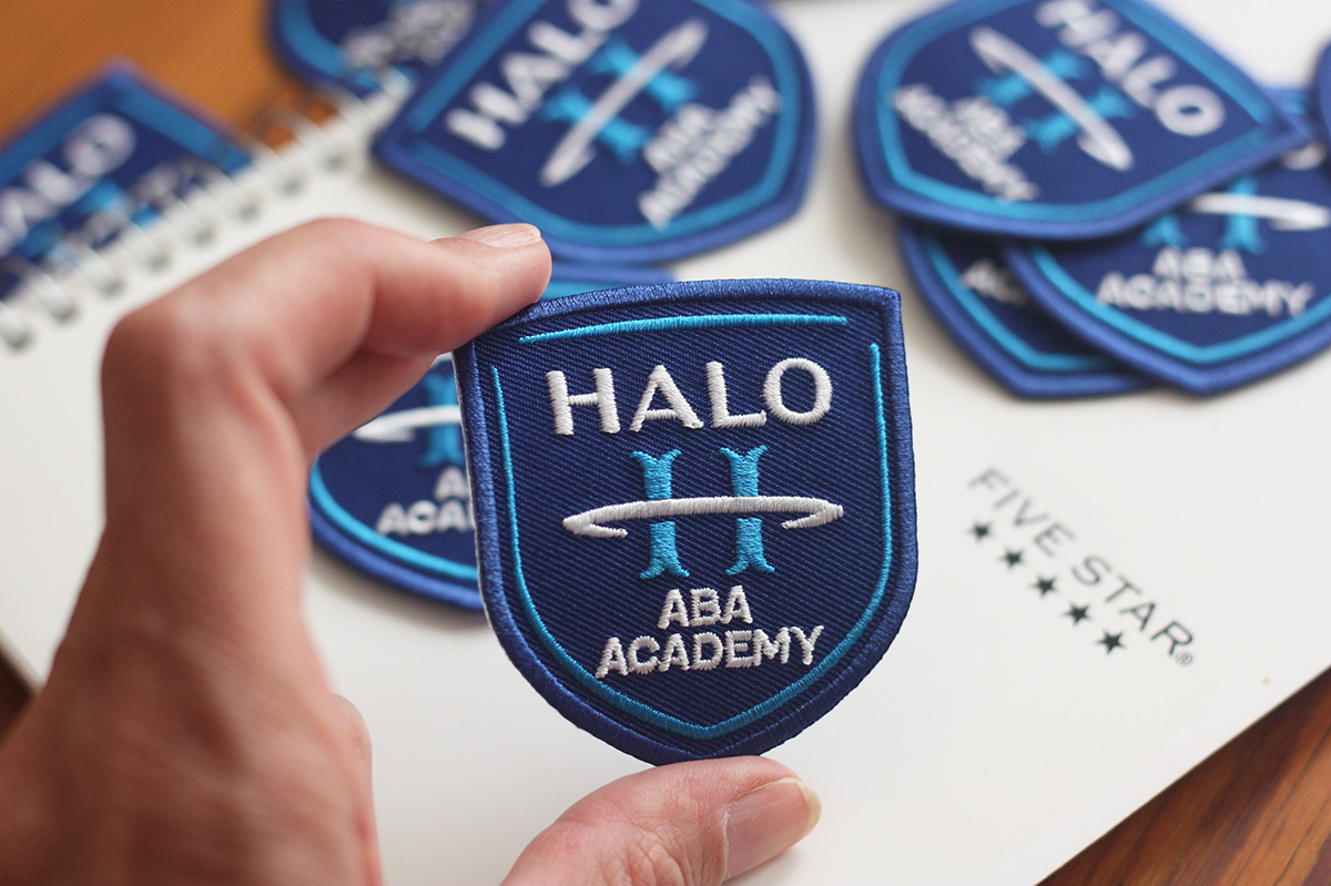
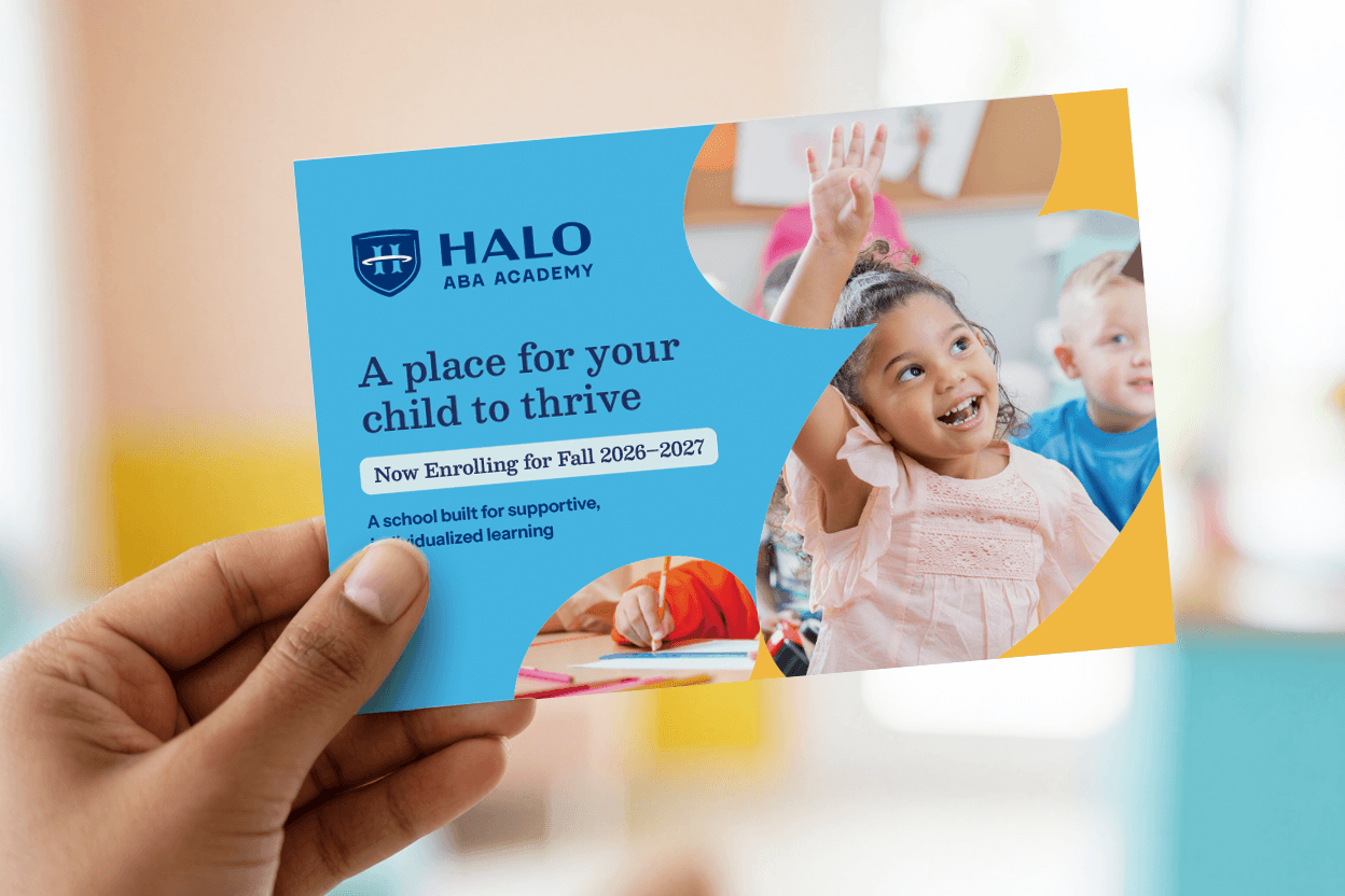
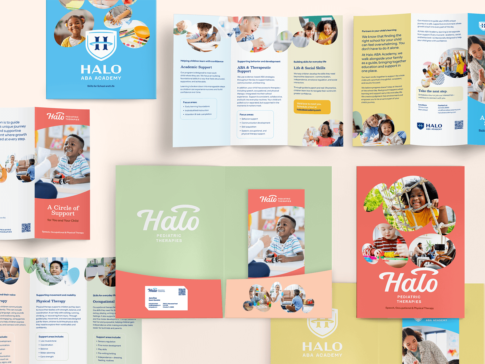
“Halo” is both a name and a concept: being surrounded with help and protection. The brand family includes Halo Pediatric Therapies (speech, occupational, and physical therapy), Halo Nannies, and Halo ABA Academy. Each operates as its own distinct offering, but all three live under the same warm, cheerful visual language.
A script wordmark is friendly and approachable for Therapies and Nannies. Halo ABA Academy breaks from the script and uses a bold shield, reflecting its more structured, academic character. Each logo includes the same halo emblem for continuity.
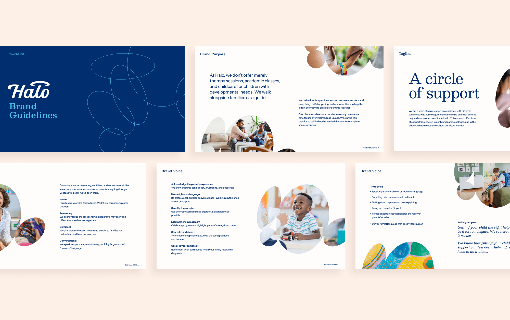
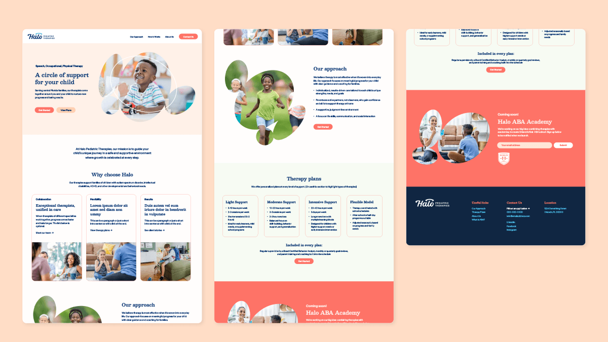
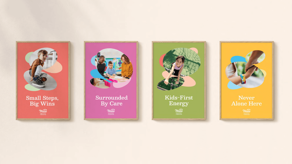
To go with the name the founders had chosen, I created a unifying theme for the brand: “A Circle of Support.” It emphasizes the idea of coming around a family from multiple sides to help them. This phrase gets used in copywriting, and also translates to a visual motif.
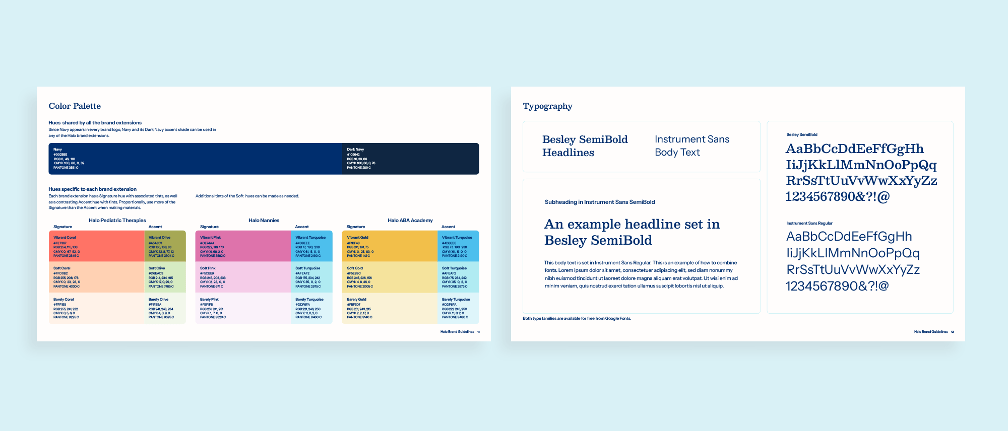
All three brands share Navy as a unifier. From there, each gets its own Signature and Accent pairing: coral with olive for Pediatric Therapies, pink with turquoise for Nannies, gold with turquoise for ABA Academy. Each hue comes in a range of tints, so designers have different values to play with.
Fonts are selected from Google Fonts, saving on licensing fees and making it easy for team members to access them.
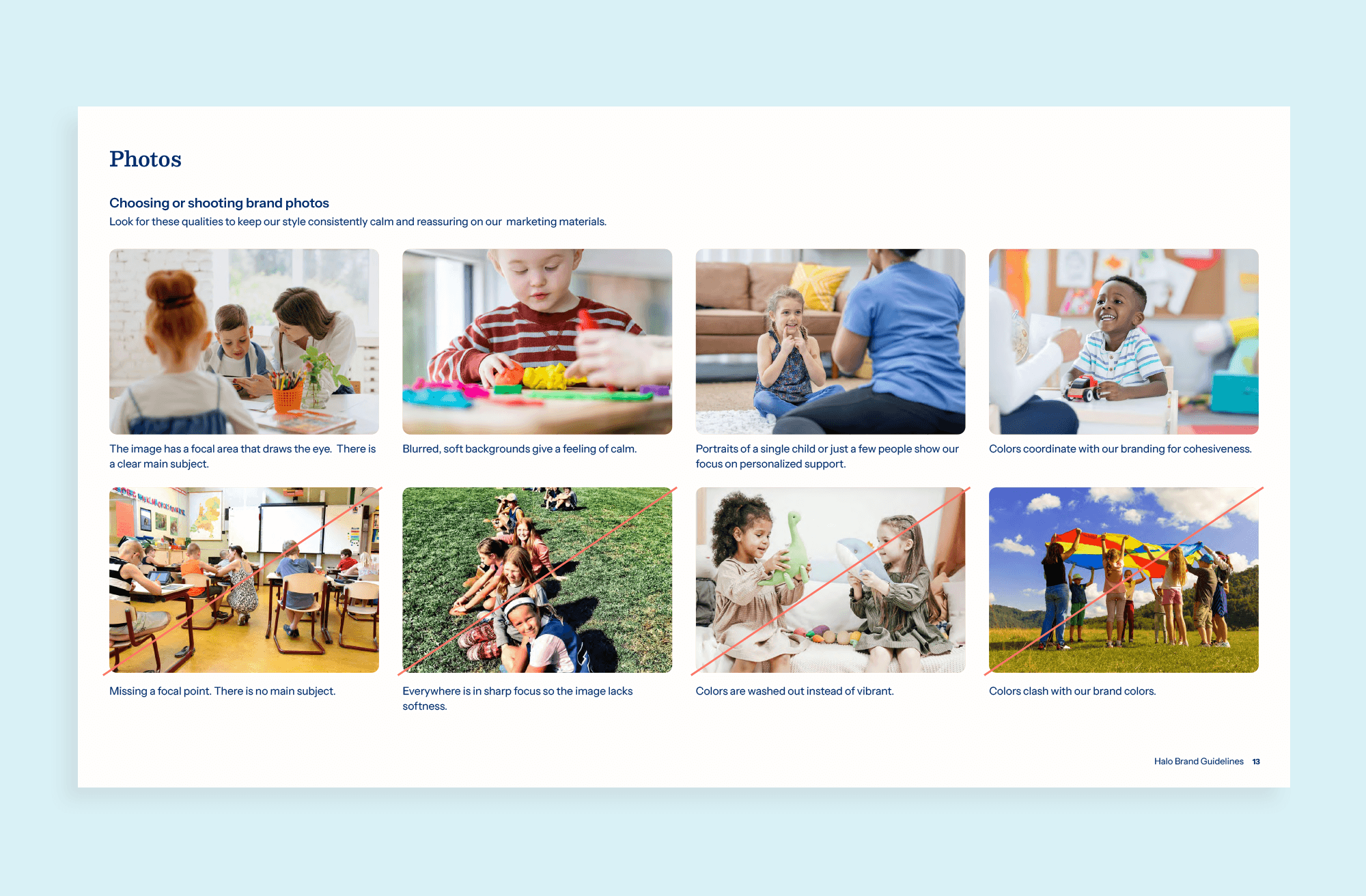
The brand guidelines document photo criteria for shooting or selecting images: simple, positive scenes with clear focal points and softly blurred backgrounds. Images should be happy and calm, never busy, and ideally contain some brand colors.
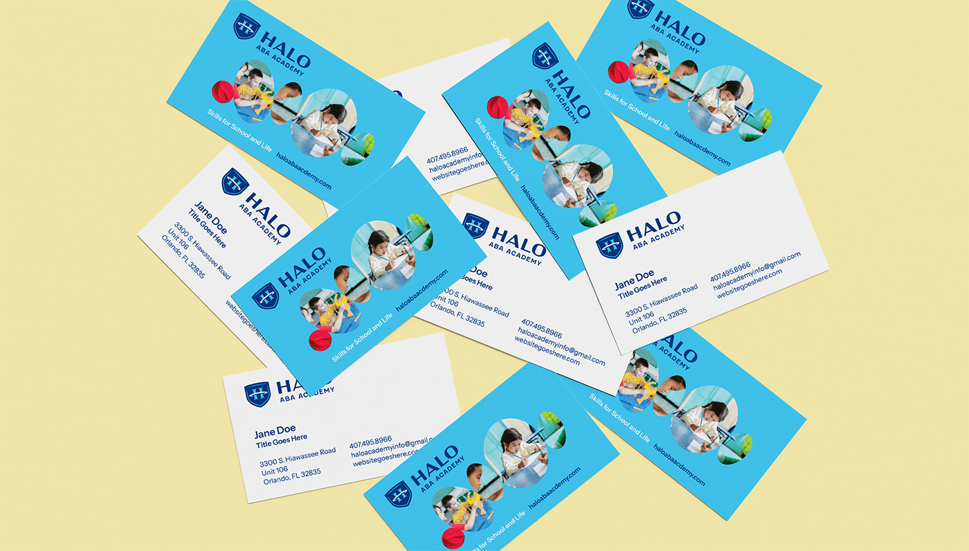
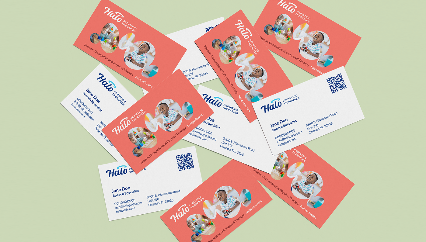
Across web, social, print, and signage, photos are framed in overlapping ovals, carrying through the “Circle of Support” theme. Using rounded corners instead of sharp angles helps everything feel kind and approachable.
In the Halo branding, meaning and design reinforce each other. The name, brand voice, shapes, colors, and photography are all coordinated to give this pediatric branding a feeling of hopefulness and comfort.