
Occam Global is an executive search firm serving founders, boards, and investors in life sciences, AI, defense, robotics, and deep tech. Started by Bill and John Holodnak in 2012, Occam was founded on the belief that executive search could be more creative, thoughtful, and principled than the industry norm.
Coming into this brand update, the visual identity already had solid bones. Our goal was to polish it into something bolder, sharper, more concise and confident. A better match to the flavor of the company.
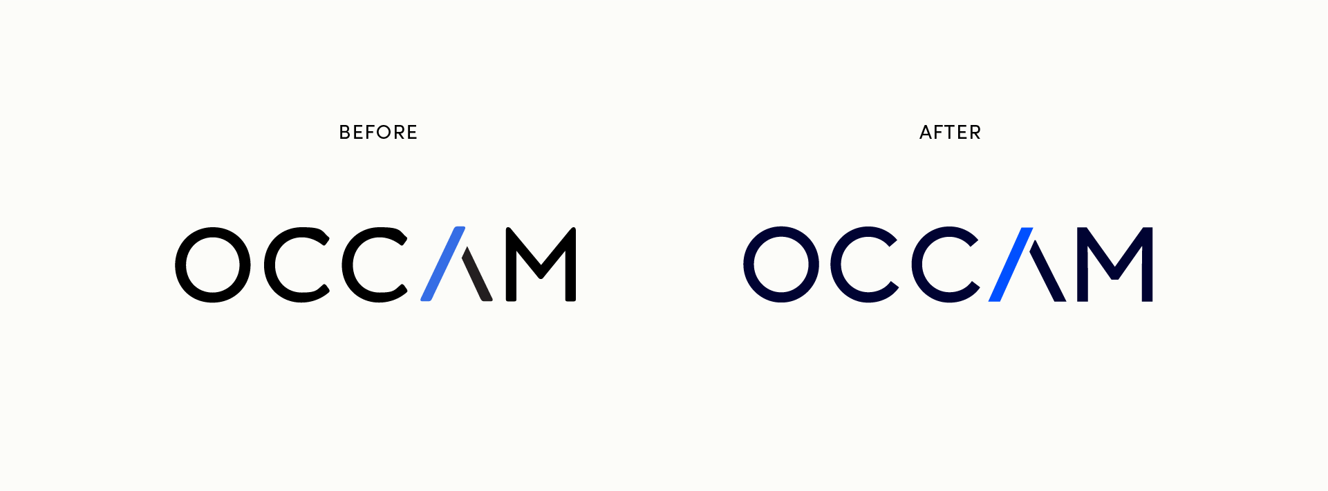
We kept the existing logo, but sharpened the corners of strokes and fixed the wobbly C’s. We gave the M a flat top to better match the apex of the A. That A hints subtly at a folding razor, a nod to Occam’s Razor.
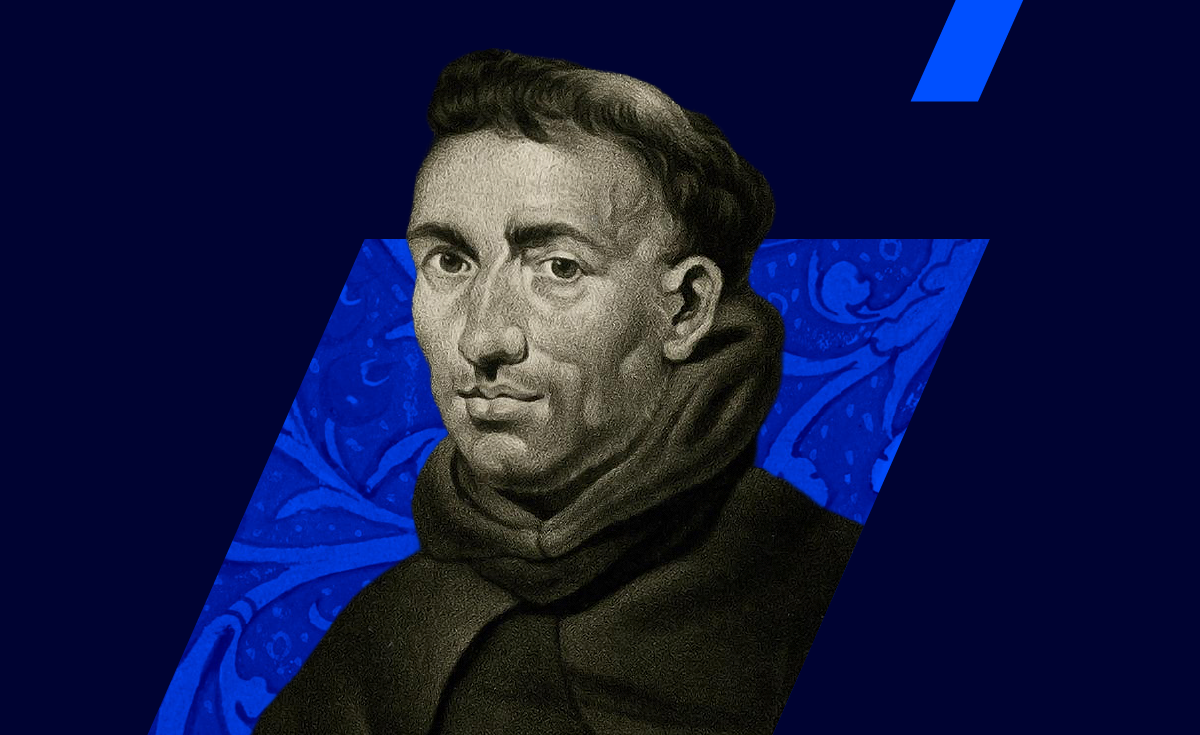
The medieval friar William of Occam has been inspirational to the company, celebrated as their patron saint. His commitment to elegant simplicity and rigorous thinking has shaped their philosophy.
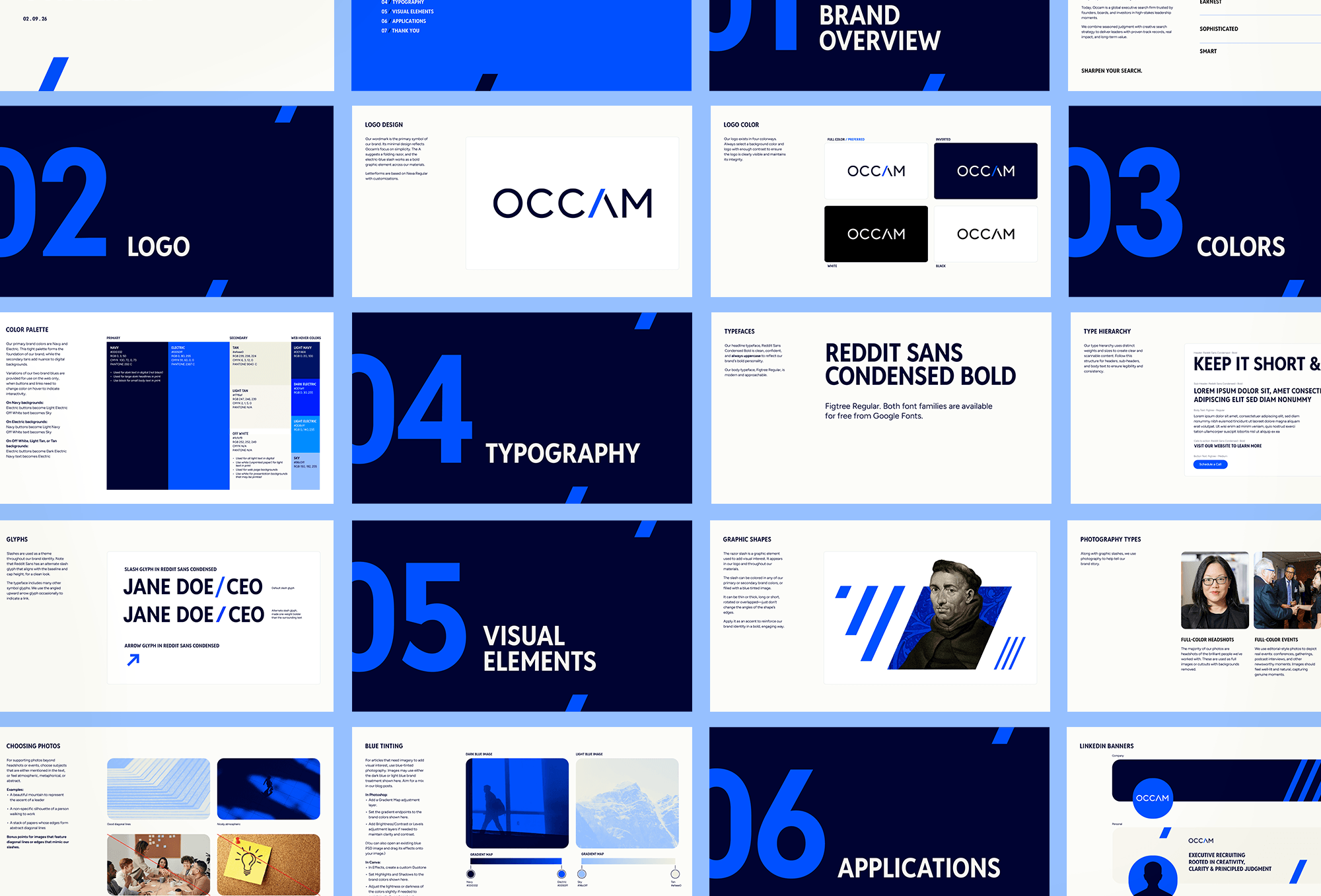
In that spirit, we made the razor slash in the logo’s A the theme of the identity. It’s sharp, simple, and easy to use: thin or thick, long or short, filled with a solid color or with an image, used alone or in a grouping. The angles of the slash edges never change, while everything else is flexible.
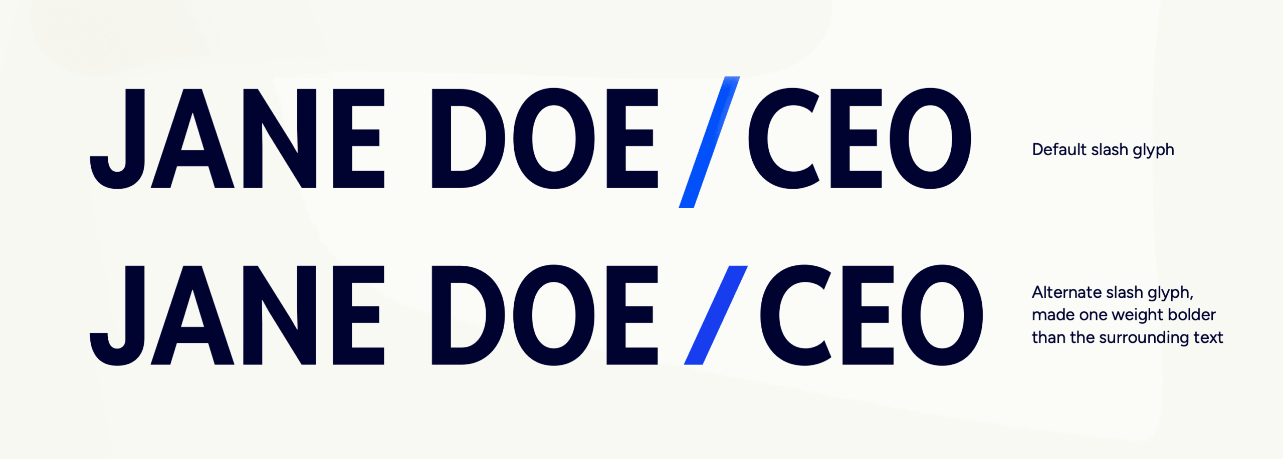
Headlines are set in Reddit Sans Condensed Bold. Reddit Sans has an extra slash glyph that aligns with the baseline and cap height, so typing clean-looking slashes in text is easy.
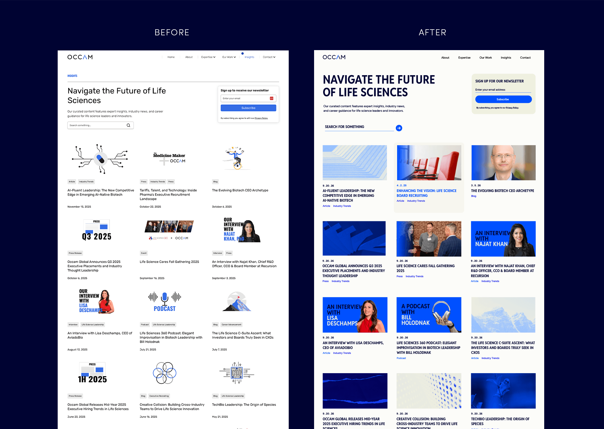
Setting headlines in bold all-caps reinforces the firm’s directness, with more presence than the old font shown below.
We wanted to add more richness to layouts, while keeping the color palette tight. A pairing of dark navy and electric blue looks authoritative and technical, with enough energy to avoid feeling stodgy. Pale tan adds warmth in accents and backgrounds.
In supporting photos, we like images with strong diagonal lines—a mountain ridge, a stack of papers, architectural edges, or abstract shapes that echo the slash idea.
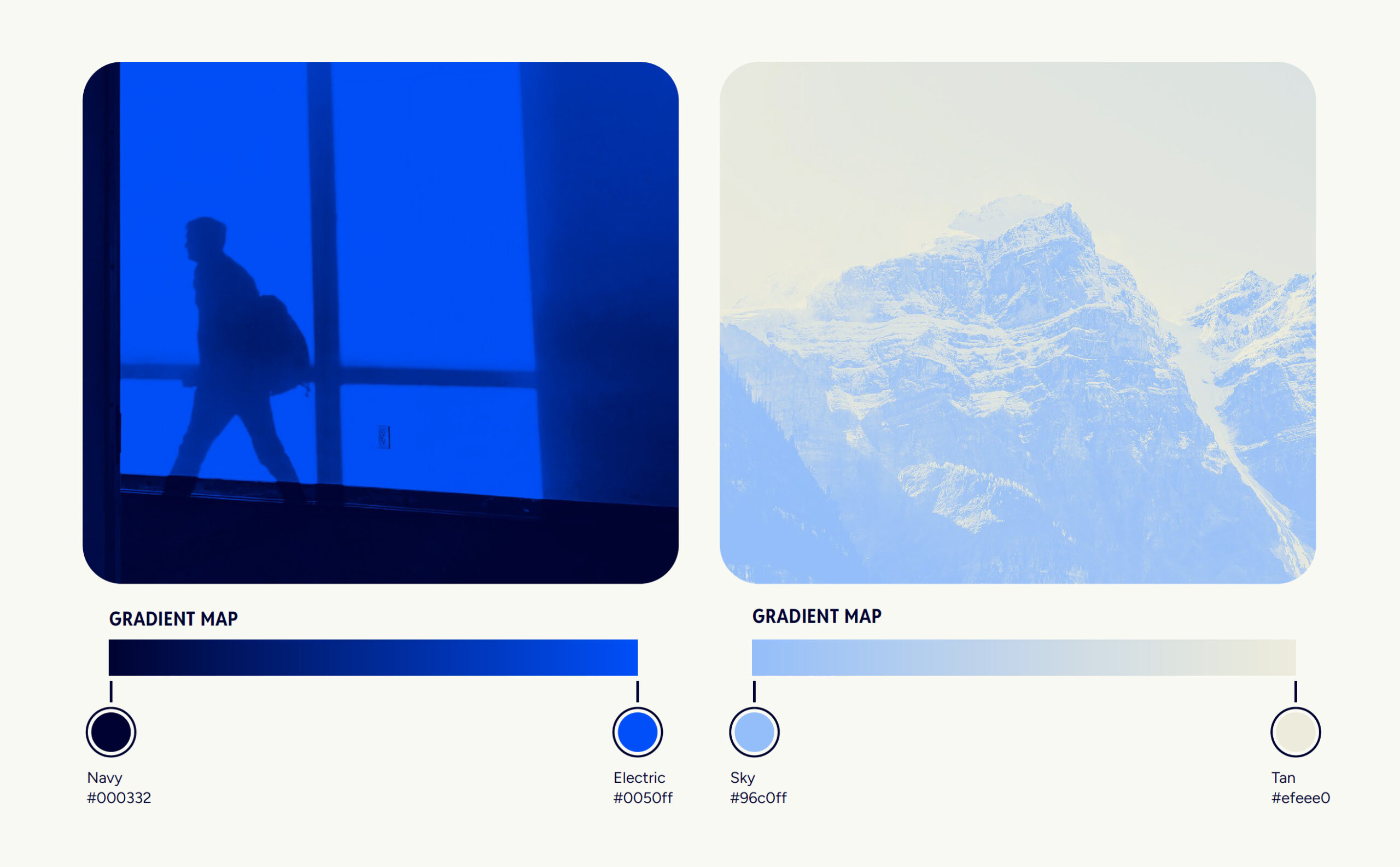

To enhance articles and blog posts, atmospheric stock photos get a duotone treatment. Using the brand colors, images end up either dark blue or light blue. The duotone makes stock imagery feel ownable instead of generic, and the guidelines include step-by-step instructions for both Photoshop and Canva.
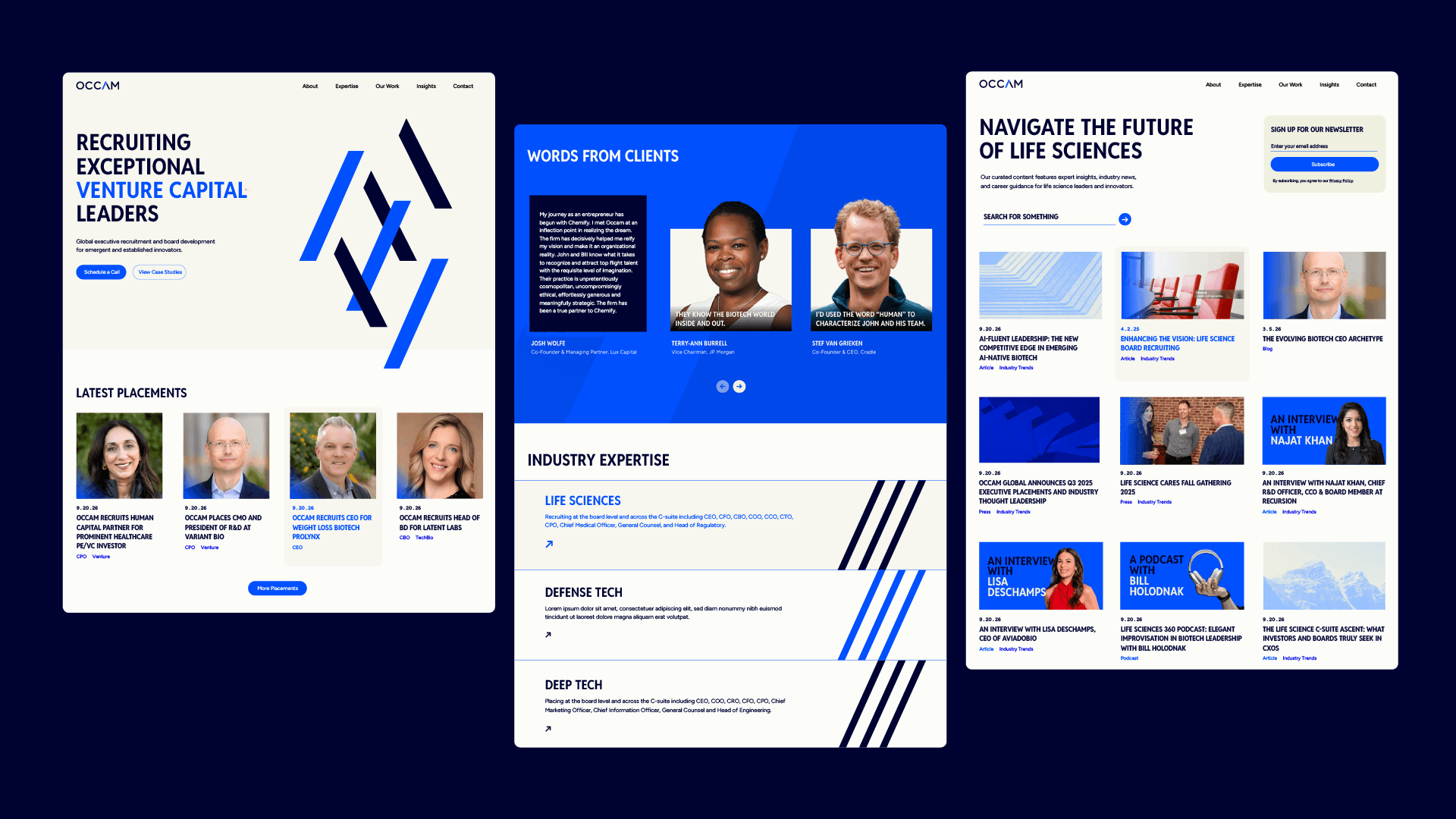
The most prominent images, though, are the stars of Occam’s brand: the people they work with. Headshots of placed executives and clients are used in full color. These are featured everywhere: on the website, LinkedIn posts, and presentation decks.
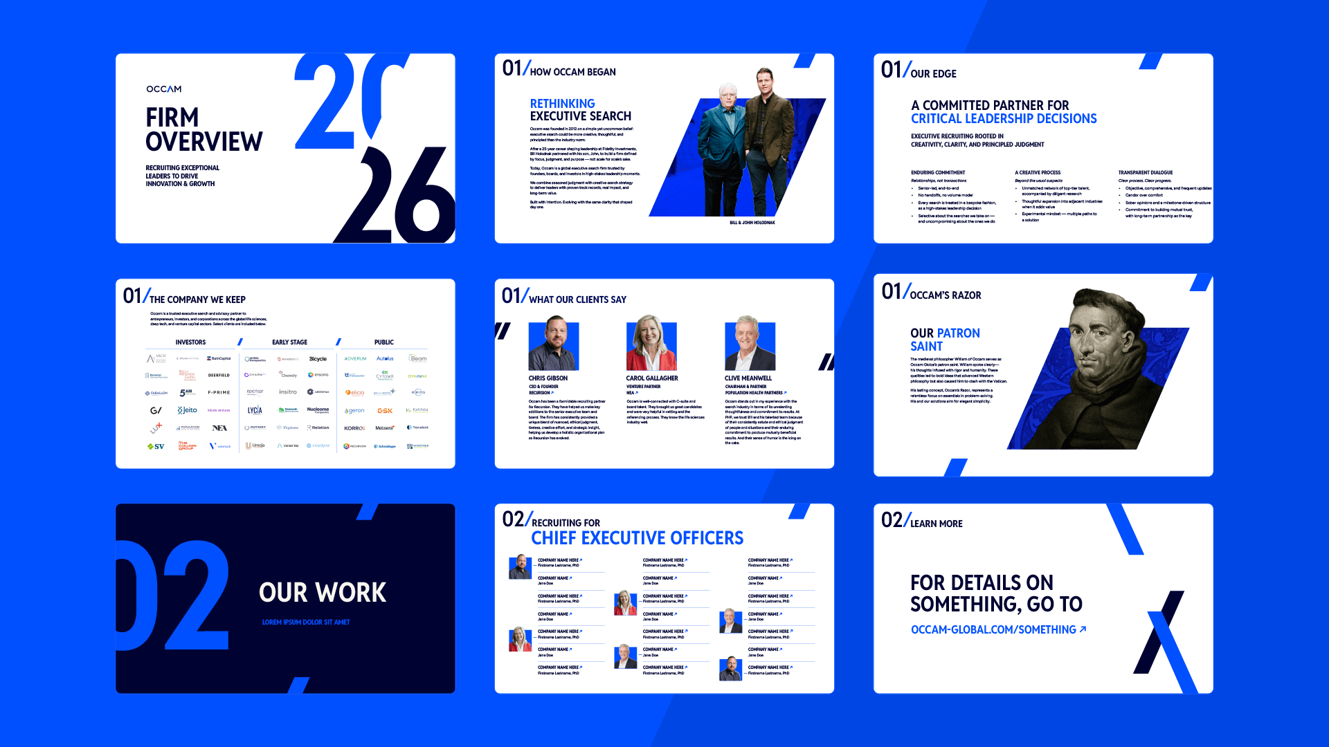
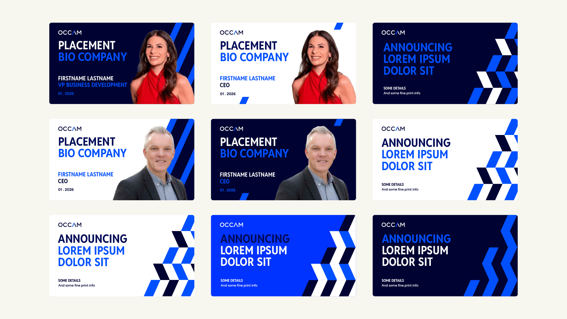
Above are pages from a presentation deck template. Below are various announcement post templates for LinkedIn, which can be animated.
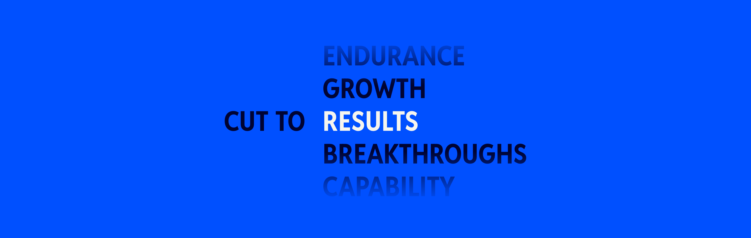
In copywriting, we added a tagline, “Sharpen Your Search.” An animated section on the website adds more flavor, as “Cut to:” rotates through the results the firm helps their clients achieve.
Overall, the brand update is a better match to the firm it represents: sharp, direct, and built around a clear point of view.