One of the many projects completed since I last updated this blog was a visual identity for the Wildflower Center for Emotional Health. It’s a brand new practice in Chicago specializing in women’s fertility and postpartum issues, along with support for relationships, self-esteem, anxiety, and work-life struggles.
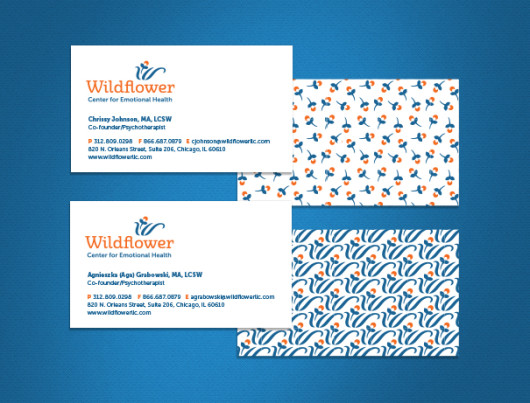
The first task was to develop a logo using the name and color palette the client had settled on: orange for vitality, grounded with blue for a feeling of safety.

Several logo concepts were presented. We refined the leaves on the client’s favorite to form a “W” and paired the mark with friendlier typography.
![]()
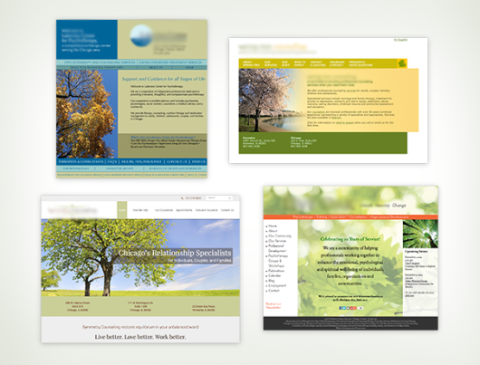
My survey of the branding of mental health practices revealed that most look a bit sad like a sympathy card: soft greens and blues paired with photographs of nature. A roundup of Chicago-based counseling practices revealed that we should not put a tree on the new website if Wildflower wants to take a fresh approach.
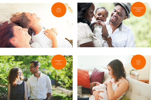
I suggested instead that Wildflower might take a note from women’s activewear brands like Lululemon or Athleta—companies that promote strength and possibility. They feature people. We decided to do the same and use photos that show someone who might feel like you do right now, or someone you want to be like someday.
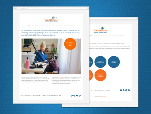
Wildflower’s vision is to be a modern center that avoids the stigma of seeking professional help and empowers clients to take an active role in feeling more balanced, alive, and confident. Their new branding will help them accomplish that.