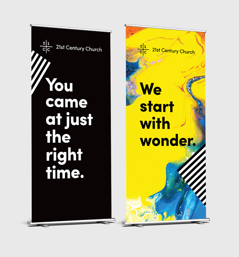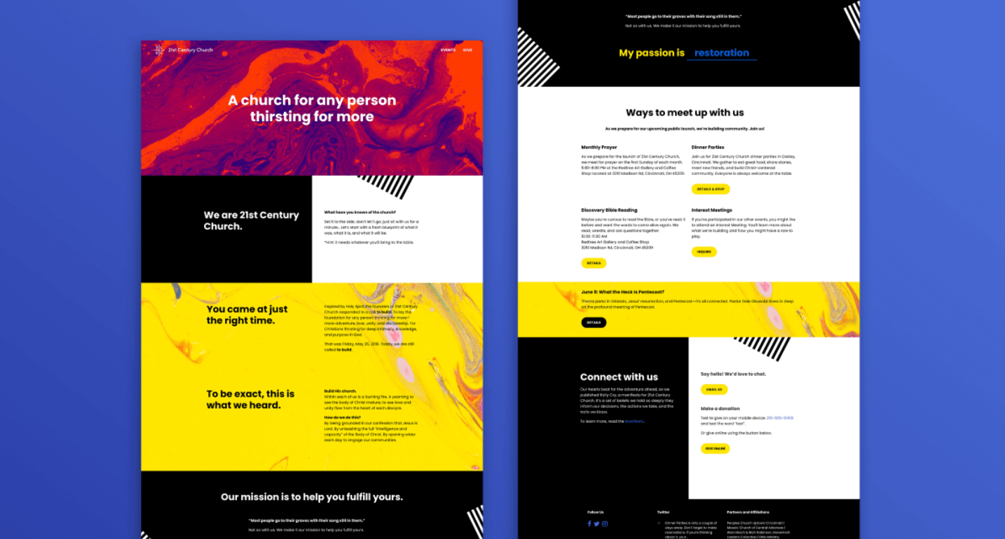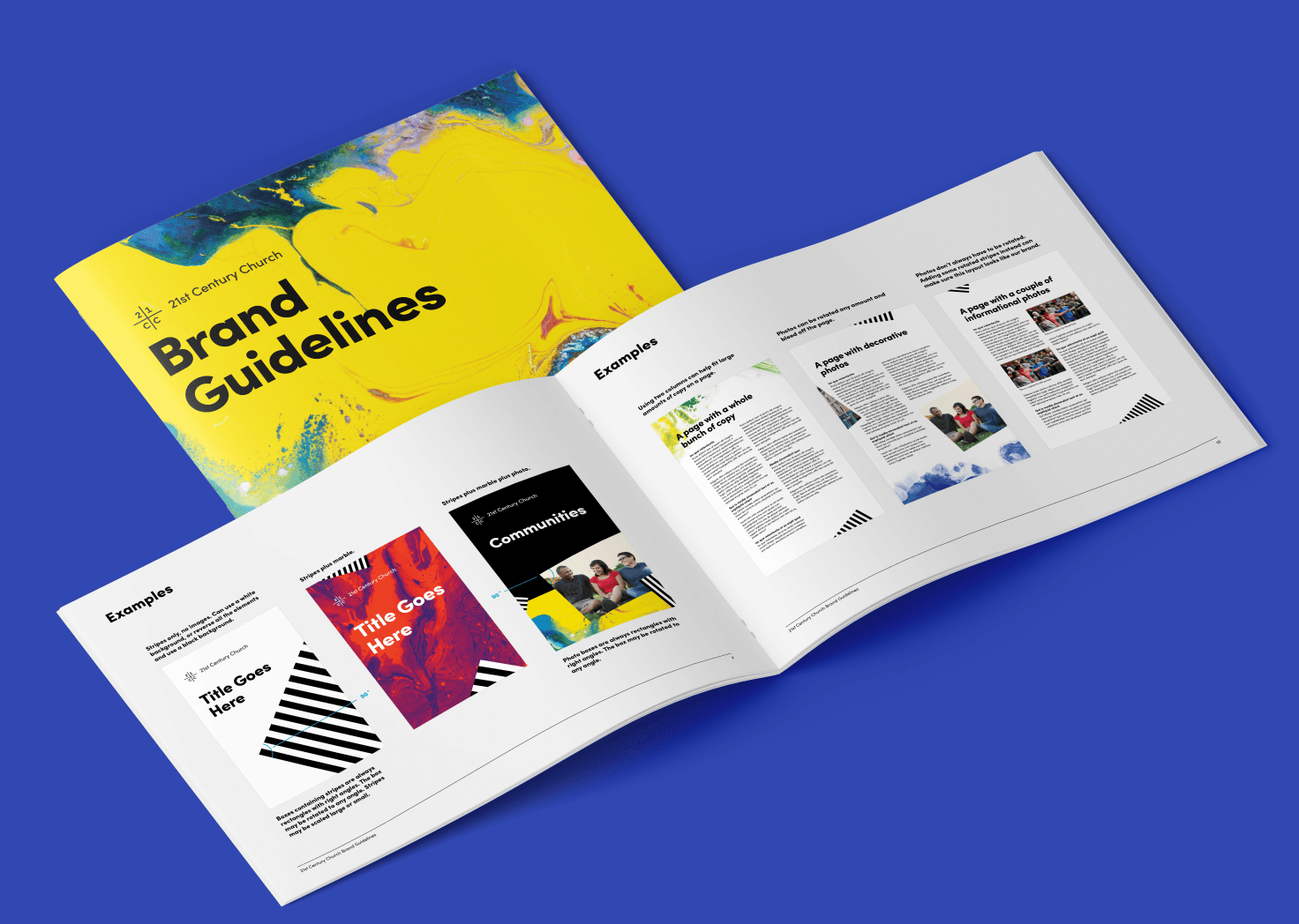
Here’s a peek at the modern, colorful church branding created for Cincinnati’s 21st Century Church. The design challenge was to create a tone that’s creative and brave. So instead of using a typical approach focused on groups of people in pews or worshipping with hands raised, we let swirling paint tell the story. The mixing colors create dynamic, beautiful artwork that symbolizes people with different gifts and backgrounds coming together in unity.
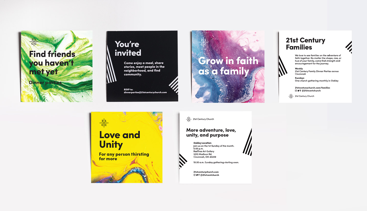
Metaphors aside, for practicality, it’s easy for the church team to use this theme. The contrasty black and white, paired with swirling paint, automatically makes any layout dynamic. Pick a paint image for a background, stick on the stripes, and you’re good to go.
This also eliminates the need for photos of people on every piece of collateral. Small organizations don’t usually have the luxury of professional photos, and stock photos can feel phony. Plus, which types of people to show, so that no one feels excluded if they don’t see themselves represented? This way the church could get up and running with a really distinctive, recognizable identity, despite not having many photos of their community and activities.
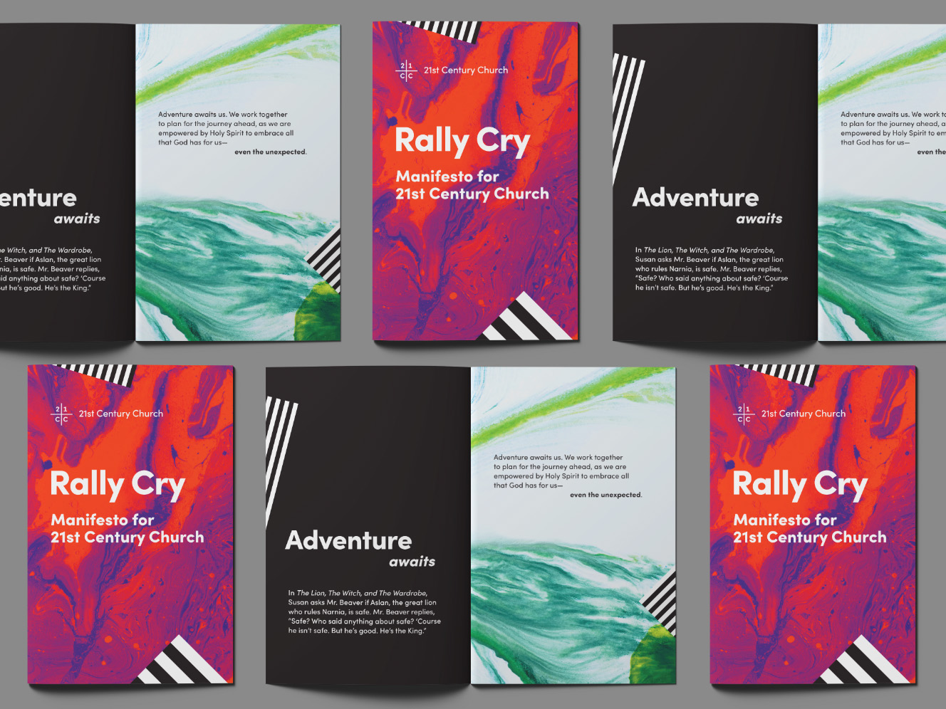
To see the church’s branding in action, flip through their manifesto online.
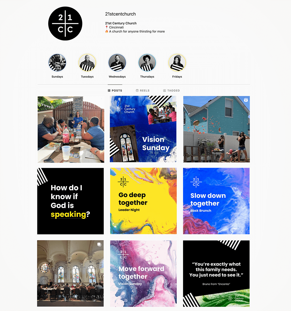
The branding results in very recognizable Instagram posts.
It also works well on the pop-up banners and leaders’ name tags used at events. Laminated badges can be customized with Sharpies or dry erase pens.