You may have seen a new flag at the 2016 Summer Olympics: the flag of The Refugee Nation, a team of 10 athletes who fled their countries to avoid persecution, war, or violence. They represent the 60 million refugees currently scattered across the world. How do you design one flag to represent people from an array of countries and cultures? I’m in awe of this solution, created by Syrian artist and refugee Yara Said.

Besides the project’s need for universality, good flag design should obey five standard principles outlined by the North American Vexillological (flag design) Association.
- Keep it simple. The flag should be so simple that a child can draw it from memory.
- Use meaningful symbolism. The flag’s images, colors, or patterns should relate to what it symbolizes.
- Use two or three basic colors. Limit the number of colors on the flag to three which contrast well and come from the standard color set.
- No lettering or seals. Never use writing on any kind or an organization’s seal.
- Be distinctive or be related. Avoid duplicating other flags, but use similarities to show connections.
The brilliant solution by Yara Said: a flag based on a life jacket, worn by “those who crossed the sea in search of a new country.” While not every refugee crossed an ocean, it’s an image seared into the minds of those following the current refugee crisis and has an emotional impact that resonates around the world. And it checks off every flag design box. Fantastic.

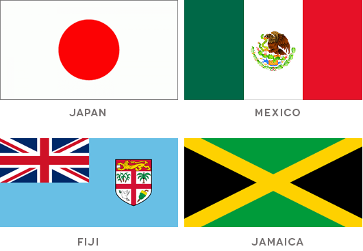
Just for fun, I’ll post the flags of a few other nations. How well do they measure up to the requirements?