A new brand identity for Tierramano reflects the company’s people-first focus in buying and nurturing great businesses and choice commercial real estate. The branding helps convey a sense of how they operate: with warmth, clarity, and integrity.
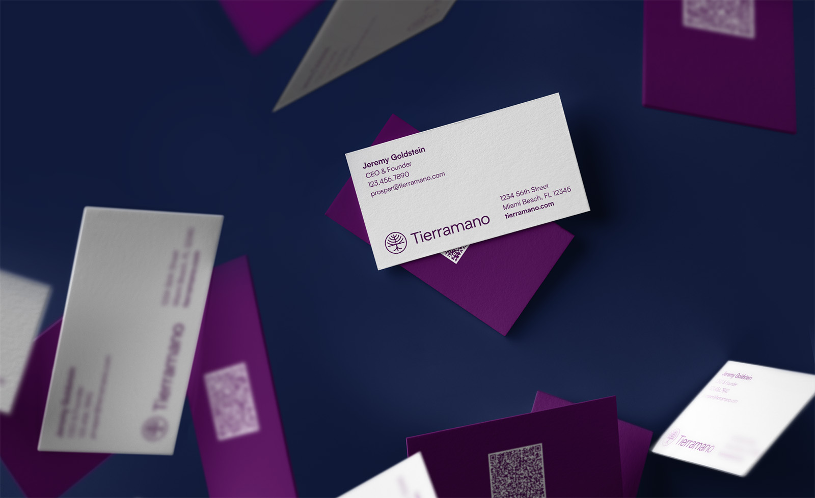
The Tierramano symbol is a tree, representing the businesses they help grow and thrive for the long term. Hidden in the tree is a T for Tierramano.
The symbol can be flipped upside down to emphasize the roots of a young company. When turned right-side up, we see a more mature organization that’s continuing to develop. The wordmark is set in a clean sans serif typeface for a contemporary feel that matches the symbol.
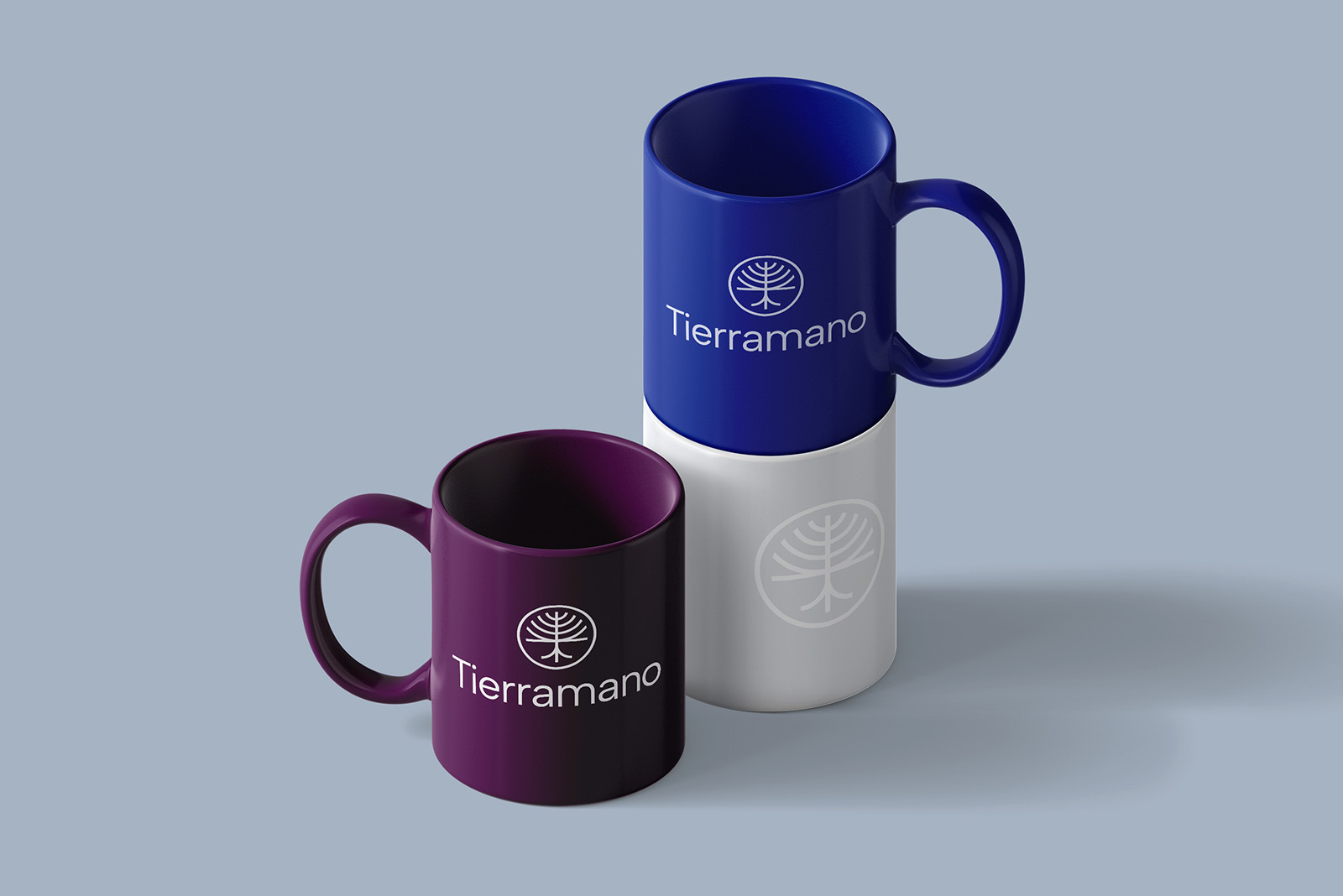
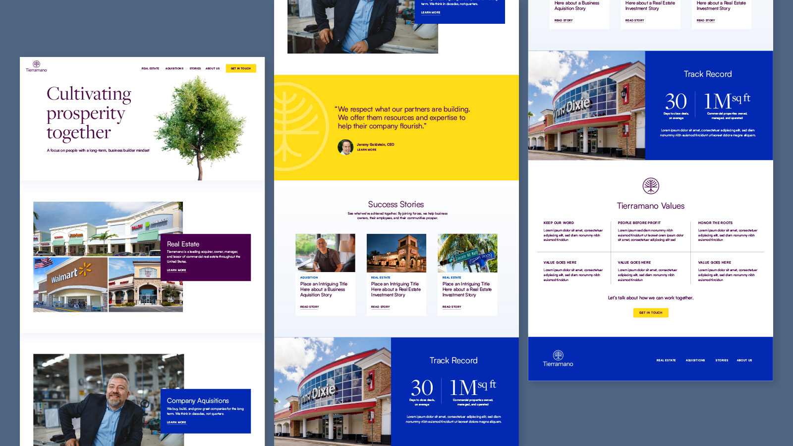
Generous white space in layouts gives a fresh, simple, honest feel. This is punctuated with bright colors. Purple, used in the logo, is regal and suggests quality. Blue conveys trust and stability, and yellow adds optimism and energy.
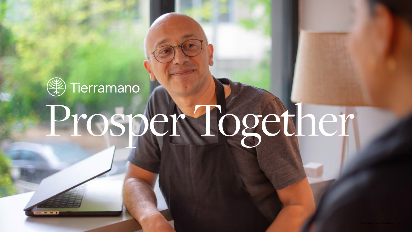
Warm photos of people that are satisfied and relaxed hint at what it feels like to partner with Tierramano.
Whether investing in commercial real estate or acquiring businesses, Tierramano’s brand identity reflects their dedication to growth, lasting value, and empowering people and partners to thrive.